Chapter 5: Introduction to presenting statistical analyses using SAS
Box 5.3 Assessing non-response bias
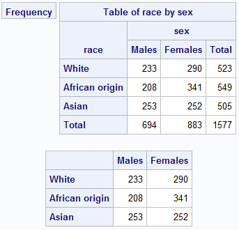
Box 5.3 Code
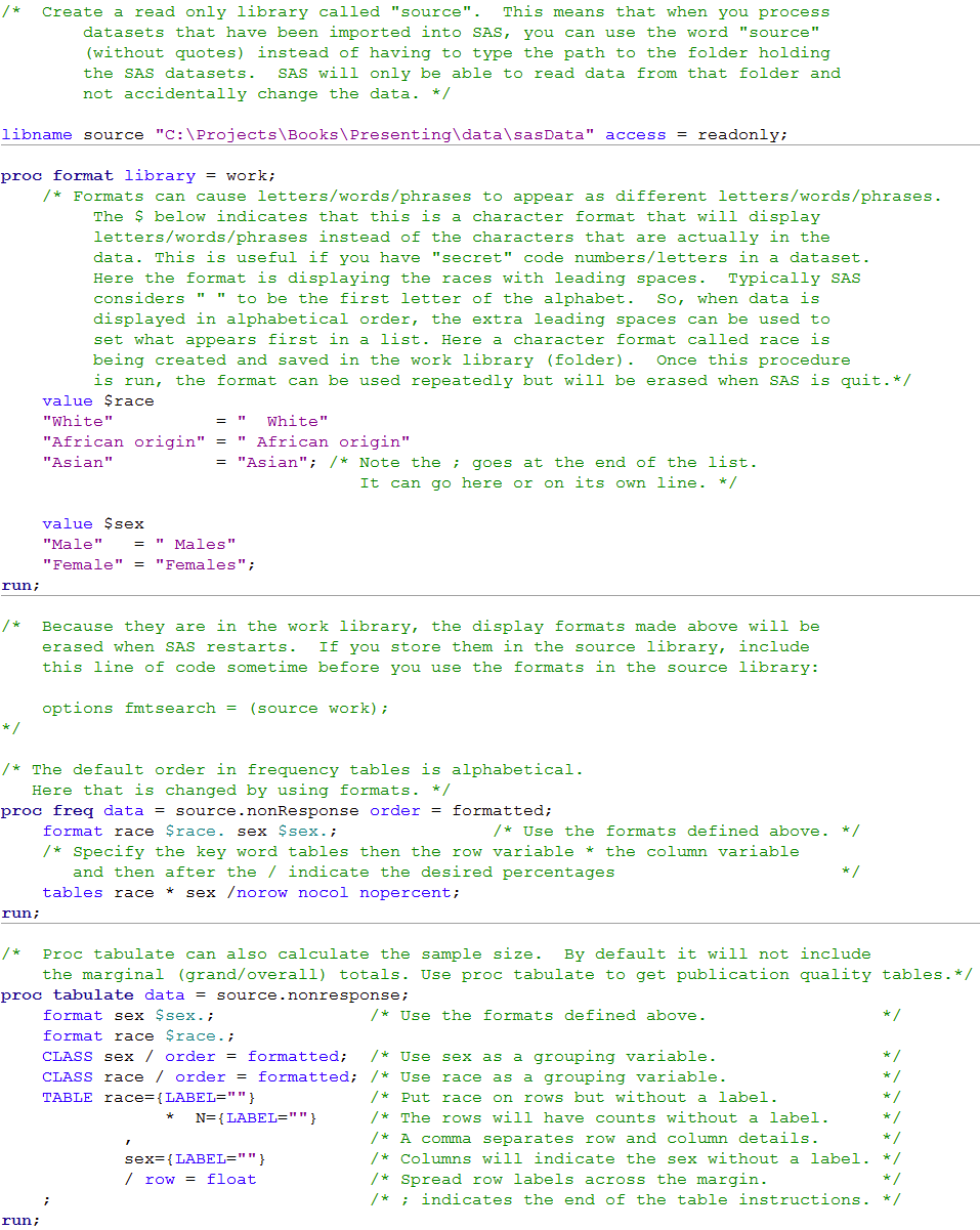
/*  Create a read only library called "source".  This means that when you process
        datasets that have been imported into SAS, you can use the word "source"
        (without quotes) instead of having to type the path to the folder holding
        the SAS datasets.  SAS will only be able to read data from that folder and
        not accidentally change the data. */

libname source "C:\Projects\Books\Presenting\data\sasData" access = readonly;

proc format library = work;
    /* Formats can cause letters/words/phrases to appear as different letters/words/phrases.
         The $ below indicates that this is a character format that will display
         letters/words/phrases instead of the characters that are actually in the
         data. This is useful if you have "secret" code numbers/letters in a dataset.
         Here the format is displaying the races with leading spaces.  Typically SAS
         considers " " to be the first letter of the alphabet.  So, when data is
         displayed in alphabetical order, the extra leading spaces can be used to
         set what appears first in a list. Here a character format called race is
         being created and saved in the work library (folder).  Once this procedure
         is run, the format can be used repeatedly but will be erased when SAS is quit.*/
    value $race
    "White"          = "  White"
    "African origin" = " African origin"
    "Asian"          = "Asian"; /* Note the ; goes at the end of the list.
                                   It can go here or on its own line. */

    value $sex
    "Male"   = " Males"
    "Female" = "Females";
run;

/*  Because they are in the work library, the display formats made above will be
    erased when SAS restarts.  If you store them in the source library, include
    this line of code sometime before you use the formats in the source library:

    options fmtsearch = (source work);
*/

/* The default order in frequency tables is alphabetical.
   Here that is changed by using formats. */
proc freq data = source.nonResponse order = formatted;
    format race $race. sex $sex.;               /* Use the formats defined above. */
    /* Specify the key word tables then the row variable * the column variable
       and then after the / indicate the desired percentages                      */
    tables race * sex /norow nocol nopercent;
run;

/*  Proc tabulate can also calculate the sample size.  By default it will not include
    the marginal (grand/overall) totals. Use proc tabulate to get publication quality tables.*/
proc tabulate data = source.nonresponse;
    format sex $sex.;               /* Use the formats defined above.                 */
    format race $race.;
    CLASS sex / order = formatted;  /* Use sex as a grouping variable.                */
    CLASS race / order = formatted; /* Use race as a grouping variable.               */
    TABLE race={LABEL=""}           /* Put race on rows but without a label.          */
                *  N={LABEL=""}     /* The rows will have counts without a label.     */
            ,                       /* A comma separates row and column details.      */
            sex={LABEL=""}          /* Columns will indicate the sex without a label. */
            / row = float           /* Spread row labels across the margin.           */
    ;                               /* ; indicates the end of the table instructions. */
run;
Box 5.4 Population profile from a report

Box 5.4 Code
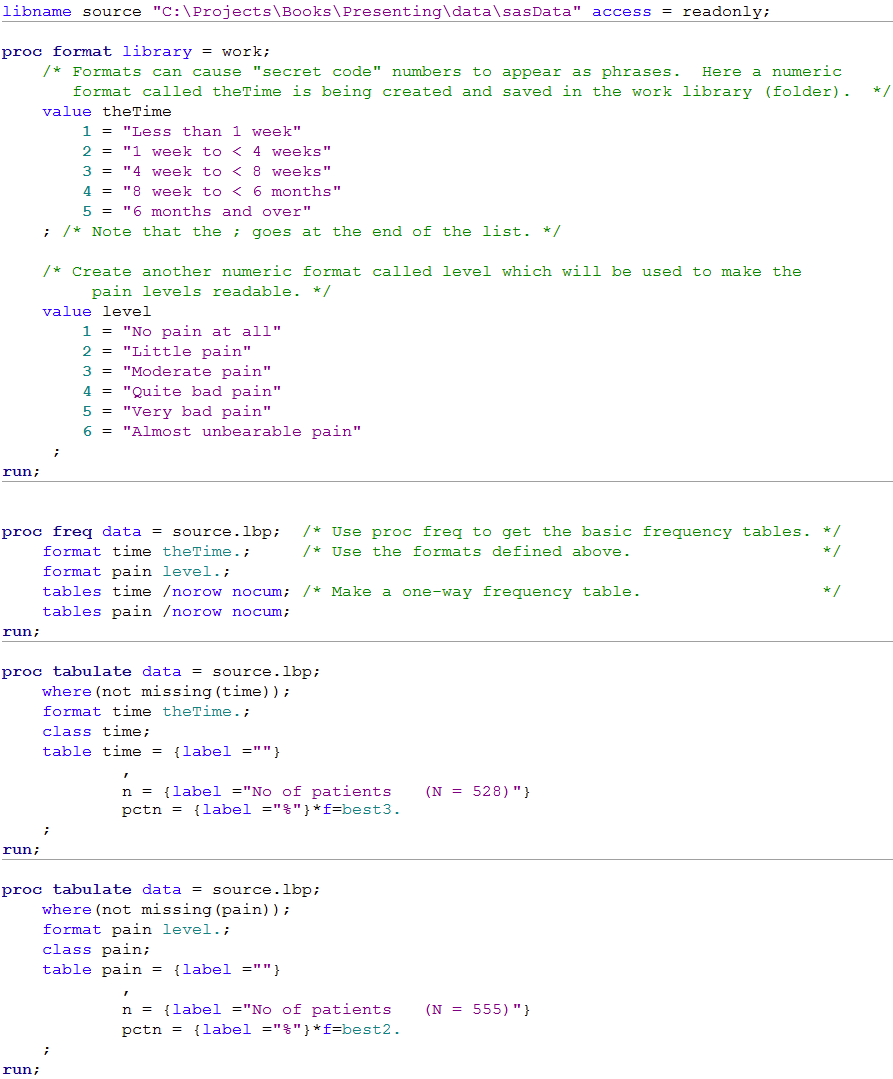 Click here to show code as text
libname source "C:\Projects\Books\Presenting\data\sasData" access = readonly;

proc format library = work;
    /* Formats can cause "secret code" numbers to appear as phrases.  Here a numeric
       format called theTime is being created and saved in the work library (folder).  */
    value theTime
        1 = "Less than 1 week"
        2 = "1 week to < 4 weeks"
        3 = "4 week to < 8 weeks"
        4 = "8 week to < 6 months"
        5 = "6 months and over"
    ; /* Note that the ; goes at the end of the list. */

    /* Create another numeric format called level which will be used to make the
         pain levels readable. */
    value level
        1 = "No pain at all"
        2 = "Little pain"
        3 = "Moderate pain"
        4 = "Quite bad pain"
        5 = "Very bad pain"
        6 = "Almost unbearable pain"
     ;
run;


proc freq data = source.lbp;  /* Use proc freq to get the basic frequency tables. */
    format time theTime.;     /* Use the formats defined above.                   */
    format pain level.;
    tables time /norow nocum; /* Make a one-way frequency table.                  */
    tables pain /norow nocum;
run;

proc tabulate data = source.lbp;
    where(not missing(time));
    format time theTime.;
    class time;
    table time = {label =""}
            ,
            n = {label ="No of patients   (N = 528)"}
            pctn = {label ="%"}*f=best3.
    ;
run;

proc tabulate data = source.lbp;
    where(not missing(pain));
    format pain level.;
    class pain;
    table pain = {label =""}
            ,
            n = {label ="No of patients   (N = 555)"}
            pctn = {label ="%"}*f=best2.
    ;
run;
Table 5.1 Single Concise table from a paper with adjusted and unadjusted estimates
Table 5.2 Table suitable for an oral presentation
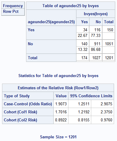
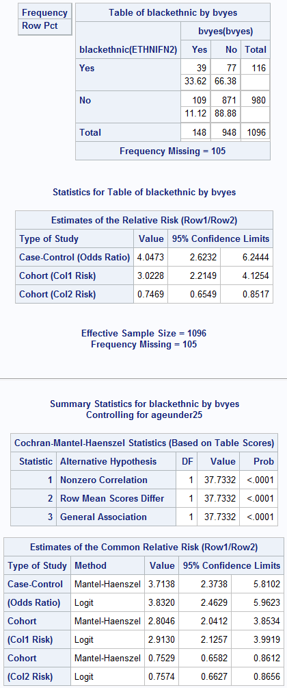
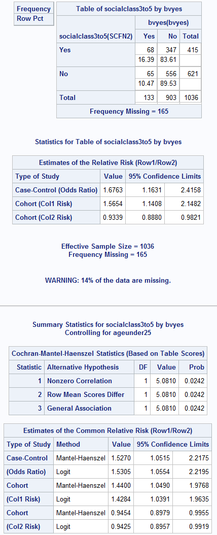
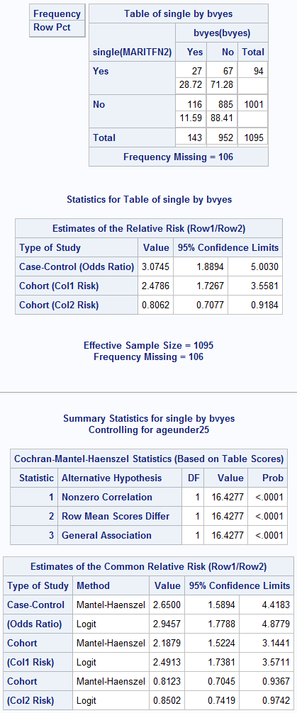
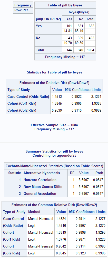
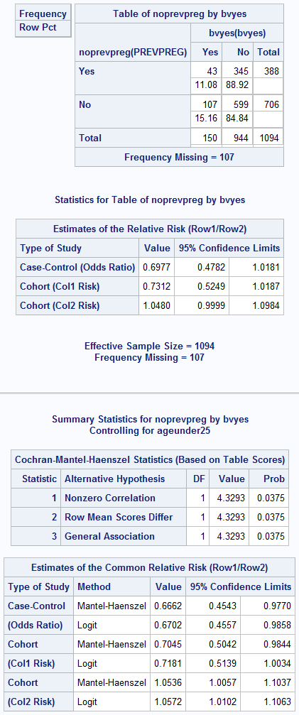
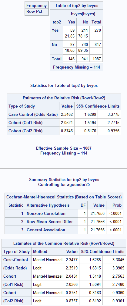
Table 5.1 and 5.2 Code
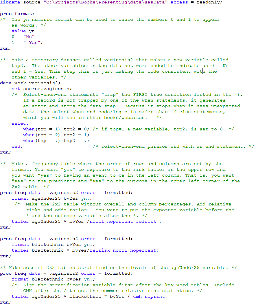
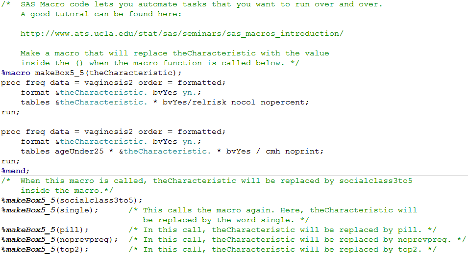 Click here to show code as text
libname source "C:\Projects\Books\Presenting\data\sasData" access = readonly;

proc format;
/*  The yn numeric format can be used to cause the numbers 0 and 1 to appear
    as words. */
    value yn
    0 = "No"
    1 = " Yes";
run;

/*  Make a temporary dataset called vaginosis2 that makes a new variable called
    top2.  The other variables in the data set were coded to indicate as 0 = No
    and 1 = Yes. This step this is just making the code consistent with the
    other variables. */
data work.vaginosis2;
    set source.vaginosis;
    /*  Select-when-end statements "trap" the FIRST true condition listed in the ().
        If a record is not trapped by one of the when statements, it generates
        an error and stops the data step.  Because it stops when it sees unexpected
        data  the select-when-end code/logic is safer than if-else statements,
        which you will see in other books/websites.   */
    select;
        when(top = 1) top2 = 0; /* if top=1 a new variable, top2, is set to 0. */
        when(top = 2) top2 = 1;
        when(top = .) top2 = .;
    end;                        /* select-when-end phrases end with an end statement. */
run;

/*  Make a frequency table where the order of rows and columns are set by the
    format. You want "yes" to exposure to the risk factor in the upper row and
    you want "yes" to having an event to be in the left column. That is, you want
    "yes" to the predictor and "yes" to the outcome in the upper left corner of the
    2x2 table. */
proc freq data = vaginosis2 order = formatted;
    format ageUnder25 bvYes yn.;
     /*  Make the 2x2 table without overall and column percentages. Add relative
         risks and odds ratios.  You want to put the exposure variable before the
         * and the outcome variable after the *. */
    tables ageUnder25 * bvYes /nocol nopercent relrisk ;
run;

proc freq data = vaginosis2 order = formatted;
    format blackethnic bvYes yn.;
    tables blackethnic * bvYes/relrisk nocol nopercent;
run;

/* Make sets of 2x2 tables stratified on the levels of the ageUnder25 variable. */
proc freq data = vaginosis2 order = formatted;
    format blackethnic bvYes yn.;
    /*  List the stratification variable first after the key word tables. Include
        CMH after the / to get the common relative risk statistics. */
    tables ageUnder25 * blackethnic * bvYes / cmh noprint;
run;

/*  SAS Macro code lets you automate tasks that you want to run over and over.
    A good tutoral can be found here:

    http://www.ats.ucla.edu/stat/sas/seminars/sas_macros_introduction/

    Make a macro that will replace theCharacteristic with the value
    inside the () when the macro function is called below. */
%macro makeBox5_5(theCharacteristic);
proc freq data = vaginosis2 order = formatted;
    format &theCharacteristic. bvYes yn.;
    tables &theCharacteristic. * bvYes/relrisk nocol nopercent;
run;

proc freq data = vaginosis2 order = formatted;
    format &theCharacteristic. bvYes yn.;
    tables ageUnder25 * &theCharacteristic. * bvYes / cmh noprint;
run;
%mend;
/*  When this macro is called, theCharacteristic will be replaced by socialclass3to5
    inside the macro.*/
%makeBox5_5(socialclass3to5);
%makeBox5_5(single);      /* This calls the macro again. Here, theCharacteristic will
                             be replaced by the word single. */
%makeBox5_5(pill);        /* In this call, theCharacteristic will be replaced by pill. */
%makeBox5_5(noprevpreg);  /* In this call, theCharacteristic will be replaced by noprevpreg. */
%makeBox5_5(top2);        /* In this call, theCharacteristic will be replaced by top2. */
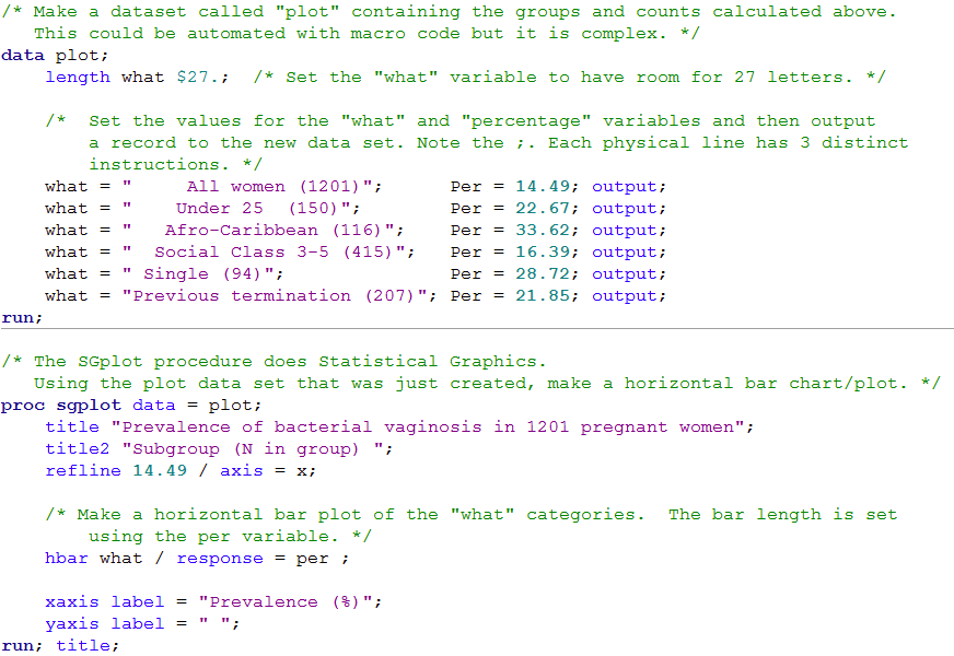
Figure 5.2 Several binary variables on one graph suitable for a poster or talk
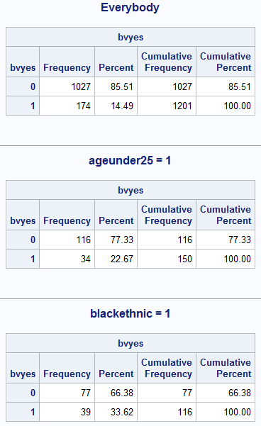
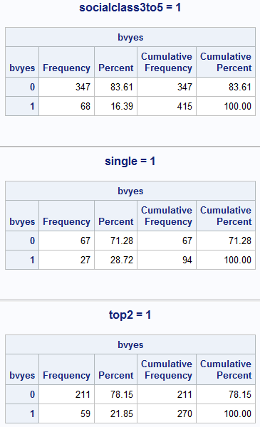
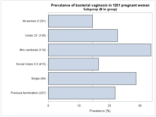
Figure 5.2 Code
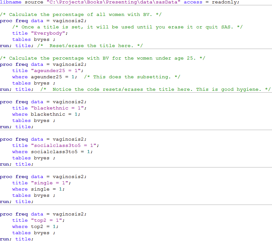
 Click here to show code as text
libname source "C:\Projects\Books\Presenting\data\sasData" access = readonly;

/* Calculate the percentage of all women with BV. */
proc freq data = vaginosis2;
    /* Once a title is set, it will be used until you erase it or quit SAS. */
    title "Everybody";
    tables bvyes ;
run; title; /*  Reset/erase the title here. */

/* Calculate the percentage with BV for the women under age 25. */
proc freq data = vaginosis2;
    title "ageunder25 = 1";
    where ageunder25 = 1;  /* This does the subsetting. */
    tables bvyes ;
run; title;  /*  Notice the code resets/erases the title here. This is good hygiene. */

proc freq data = vaginosis2;
    title "blackethnic = 1";
    where blackethnic = 1;
    tables bvyes ;
run; title;

proc freq data = vaginosis2;
    title "socialclass3to5 = 1";
    where socialclass3to5 = 1;
    tables bvyes ;
run; title;

proc freq data = vaginosis2;
    title "single = 1";
    where single = 1;
    tables bvyes ;
run; title;

proc freq data = vaginosis2;
    title "top2 = 1";
    where top2 = 1;
    tables bvyes ;
run; title;

/* Make a dataset called "plot" containing the groups and counts calculated above.
   This could be automated with macro code but it is complex. */
data plot;
    length what $27.;  /* Set the "what" variable to have room for 27 letters. */

    /*  Set the values for the "what" and "percentage" variables and then output
        a record to the new data set. Note the ;. Each physical line has 3 distinct
        instructions. */
    what = "     All women (1201)";      Per = 14.49; output;
    what = "    Under 25  (150)";        Per = 22.67; output;
    what = "   Afro-Caribbean (116)";    Per = 33.62; output;
    what = "  Social Class 3-5 (415)";   Per = 16.39; output;
    what = " Single (94)";               Per = 28.72; output;
    what = "Previous termination (207)"; Per = 21.85; output;
run;

/* The SGplot procedure does Statistical Graphics.
   Using the plot data set that was just created, make a horizontal bar chart/plot. */
proc sgplot data = plot;
    title "Prevalence of bacterial vaginosis in 1201 pregnant women";
    title2 "Subgroup (N in group) ";
    refline 14.49 / axis = x;

    /* Make a horizontal bar plot of the "what" categories.  The bar length is set
       using the per variable. */
    hbar what / response = per ;

    xaxis label = "Prevalence (%)";
    yaxis label = " ";
run; title;
Figure 5.3 Graph for an ordered categorical variable suitable for poster or talk
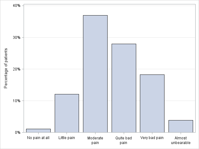
Figure 5.3 Code
 Click here to show code as text
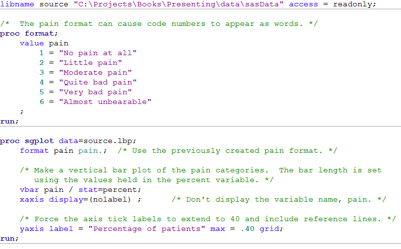
/*  The pain format can cause code numbers to appear as words. */
proc format;
    value pain
        1 = "No pain at all"
        2 = "Little pain"
        3 = "Moderate pain"
        4 = "Quite bad pain"
        5 = "Very bad pain"
        6 = "Almost unbearable"
    ;
run;

proc sgplot data=source.lbp;
    format pain pain.;  /* Use the previously created pain format.             */

    /* Make a vertical bar plot of the pain categories.  The bar length is set
       using the values held in the percent variable.                          */
    vbar pain / stat=percent;
    xaxis display=(nolabel) ;      /* Don't display the variable name, pain.   */

    /* Force the axis tick labels to extend to 40 and include reference lines. */
    yaxis label = "Percentage of patients" max = .40 grid;
run;
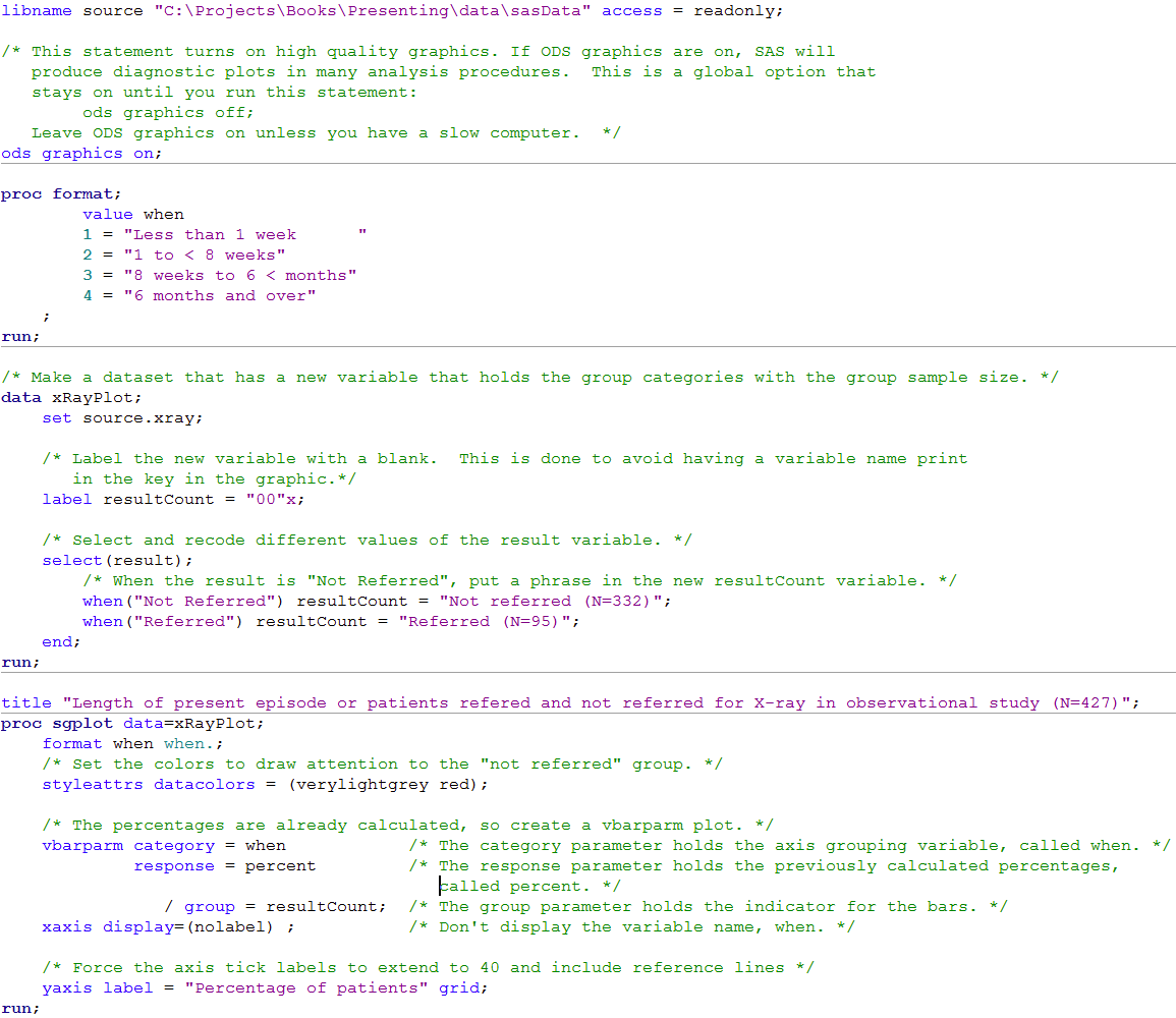
Figure 5.4 Graph comparing two groups of patients suitable for poster or talk

Figure 5.4 Code
 Click here to show code as text
libname source "C:\Projects\Books\Presenting\data\sasData" access = readonly;

/* This statement turns on high quality graphics. If ODS graphics are on, SAS will
   produce diagnostic plots in many analysis procedures.  This is a global option that
   stays on until you run this statement:
        ods graphics off;
   Leave ODS graphics on unless you have a slow computer.  */
ods graphics on;

proc format;
        value when
        1 = "Less than 1 week      "
        2 = "1 to < 8 weeks"
        3 = "8 weeks to 6 < months"
        4 = "6 months and over"
    ;
run;

/* Make a dataset that has a new variable that holds the group categories with the group sample size. */
data xRayPlot;
    set source.xray;

    /* Label the new variable with a blank.  This is done to avoid having a variable name print
       in the key in the graphic.*/
    label resultCount = "00"x;

    /* Select and recode different values of the result variable. */
    select(result);
        /* When the result is "Not Referred", put a phrase in the new resultCount variable. */
        when("Not Referred") resultCount = "Not referred (N=332)";
        when("Referred") resultCount = "Referred (N=95)";
    end;
run;

title "Length of present episode or patients refered and not referred for X-ray in observational study (N=427)";
proc sgplot data=xRayPlot;
    format when when.;
    /* Set the colors to draw attention to the "not referred" group. */
    styleattrs datacolors = (verylightgrey red);

    /* The percentages are already calculated, so create a vbarparm plot. */
    vbarparm category = when            /* The category parameter holds the axis grouping variable, called when. */
             response = percent         /* The response parameter holds the previously calculated percentages,
                                           called percent. */
                / group = resultCount;  /* The group parameter holds the indicator for the bars. */
    xaxis display=(nolabel) ;           /* Don't display the variable name, when. */

    /* Force the axis tick labels to extend to 40 and include reference lines */
    yaxis label = "Percentage of patients" grid;
run;
Figure 5.5 Calculating the confidence interval of a geometric mean
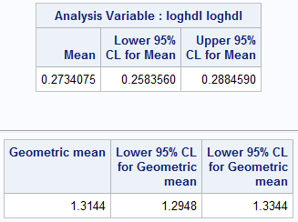
Figure 5.5 Code
 Click here to show code as text
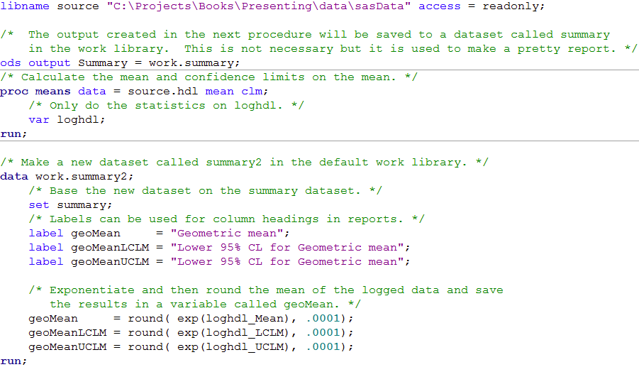
libname source "C:\Projects\Books\Presenting\data\sasData" access = readonly;

/*  The output created in the next procedure will be saved to a dataset called summary
    in the work library.  This is not necessary but it is used to make a pretty report. */
ods output Summary = work.summary;
/* Calculate the mean and confidence limits on the mean. */
proc means data = source.hdl mean clm;
    /* Only do the statistics on loghdl. */
    var loghdl;
run;

/* Make a new dataset called summary2 in the default work library. */
data work.summary2;
    /* Base the new dataset on the summary dataset. */
    set summary;
    /* Labels can be used for column headings in reports. */
    label geoMean     = "Geometric mean";
    label geoMeanLCLM = "Lower 95% CL for Geometric mean";
    label geoMeanUCLM = "Lower 95% CL for Geometric mean";

    /* Exponentiate and then round the mean of the logged data and save
       the results in a variable called geoMean. */
    geoMean     = round( exp(loghdl_Mean), .0001);
    geoMeanLCLM = round( exp(loghdl_LCLM), .0001);
    geoMeanUCLM = round( exp(loghdl_UCLM), .0001);
run;

/* Print the dataset without observation (row) numbers and use labels. */
proc print data = summary2 noobs label;
    /* Only include the three variables. */
    var geoMean geoMeanLCLM geoMeanUCLM;
run;
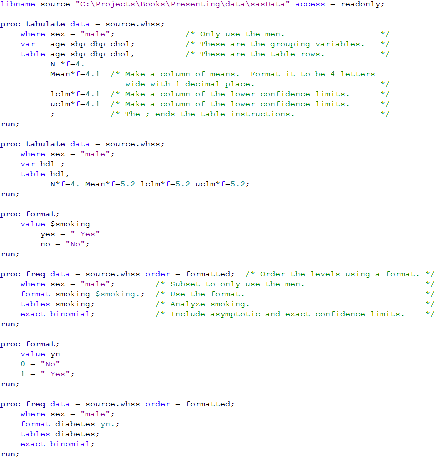
Table 5.3 Presenting several types of variables with a common theme in one table

Table 5.3 Code
 Click here to show code as text
libname source "C:\Projects\Books\Presenting\data\sasData" access = readonly;

proc tabulate data = source.whss;
    where sex = "male";              /* Only use the men.                   */
    var   age sbp dbp chol;          /* These are the grouping variables.   */
    table age sbp dbp chol,          /* These are the table rows.           */
          N *f=4.
          Mean*f=4.1  /* Make a column of means.  Format it to be 4 letters
                         wide with 1 decimal place.                         */
          lclm*f=4.1  /* Make a column of the lower confidence limits.      */
          uclm*f=4.1  /* Make a column of the lower confidence limits.      */
          ;           /* The ; ends the table instructions.                 */
run;

proc tabulate data = source.whss;
    where sex = "male";
    var hdl ;
    table hdl,
          N*f=4. Mean*f=5.2 lclm*f=5.2 uclm*f=5.2;
run;

proc format;
    value $smoking
        yes = " Yes"
        no = "No";
run;

proc freq data = source.whss order = formatted;  /* Order the levels using a format. */
    where sex = "male";        /* Subset to only use the men.                        */
    format smoking $smoking.;  /* Use the format.                                    */
    tables smoking;            /* Analyze smoking.                                   */
    exact binomial;            /* Include asymptotic and exact confidence limits.    */
run;

proc format;
    value yn
    0 = "No"
    1 = " Yes";
run;

proc freq data = source.whss order = formatted;
    where sex = "male";
    format diabetes yn.;
    tables diabetes;
    exact binomial;
run;
Figure 5.6 Using a graph to compare a distribution with a cut-off
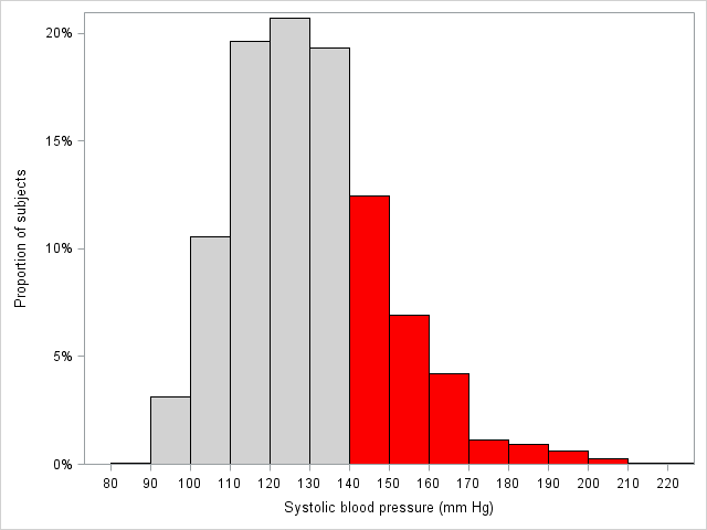
Figure 5.6 Code
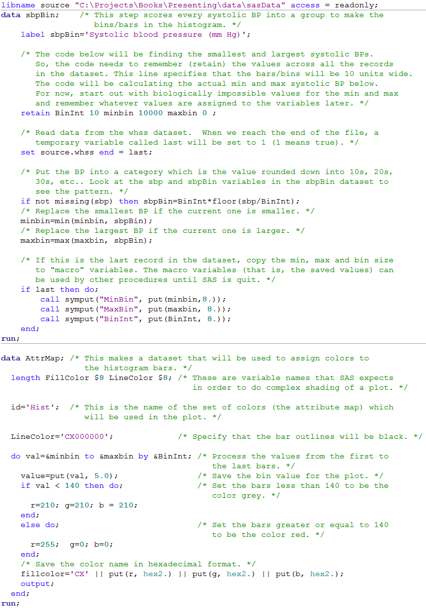
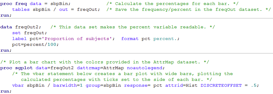
This code is advanced. It uses many functions, retain statements, macro code and hexidecimal color codes. UCLA has a lot of good information on SAS including an introduction to macro which can be found here. You can learn about how computers deal with colors here. The Little SAS Book, which can be found here, has a lot of useful information about SAS coding.
 Click here to show code as text
libname source "C:\Projects\Books\Presenting\data\sasData" access = readonly;
data sbpBin;    /* This step scores every systolic BP into a group to make the
                   bins/bars in the histogram. */
    label sbpBin='Systolic blood pressure (mm Hg)';

    /* The code below will be finding the smallest and largest systolic BPs.
       So, the code needs to remember (retain) the values across all the records
       in the dataset. This line specifies that the bars/bins will be 10 units wide.
       The code will be calculating the actual min and max systolic BP below.
       For now, start out with biologically impossible values for the min and max
       and remember whatever values are assigned to the variables later. */
    retain BinInt 10 minbin 10000 maxbin 0 ;

    /* Read data from the whss dataset.  When we reach the end of the file, a
       temporary variable called last will be set to 1 (1 means true). */
    set source.whss end = last;

    /* Put the BP into a category which is the value rounded down into 10s, 20s,
       30s, etc.. Look at the sbp and sbpBin variables in the sbpBin dataset to
       see the pattern. */
    if not missing(sbp) then sbpBin=BinInt*floor(sbp/BinInt);
    /* Replace the smallest BP if the current one is smaller. */
    minbin=min(minbin, sbpBin);
    /* Replace the largest BP if the current one is larger. */
    maxbin=max(maxbin, sbpBin);

    /* If this is the last record in the dataset, copy the min, max and bin size
       to "macro" variables. The macro variables (that is, the saved values) can
       be used by other procedures until SAS is quit. */
    if last then do;
        call symput("MinBin", put(minbin,8.));
        call symput("MaxBin", put(maxbin, 8.));
        call symput("BinInt", put(BinInt, 8.));
    end;
run;

data AttrMap; /* This makes a dataset that will be used to assign colors to
                 the histogram bars. */
  length FillColor $8 LineColor $8; /* These are variable names that SAS expects
                                       in order to do complex shading of a plot. */

  id='Hist';  /* This is the name of the set of colors (the attribute map) which
                 will be used in the plot. */

  LineColor='CX000000';             /* Specify that the bar outlines will be black. */

  do val=&minbin to &maxbin by &BinInt; /* Process the values from the first to
                                           the last bars. */
    value=put(val, 5.0);                /* Save the bin value for the plot. */
    if val < 140 then do;               /* Set the bars less than 140 to be the
                                           color grey. */
      r=210; g=210; b = 210;
    end;
    else do;                            /* Set the bars greater or equal to 140
                                           to be the color red. */
      r=255;  g=0; b=0;
    end;
    /* Save the color name in hexadecimal format. */
    fillcolor='CX' || put(r, hex2.) || put(g, hex2.) || put(b, hex2.);
    output;
  end;
run;

proc freq data = sbpBin;            /* Calculate the percentages for each bar. */
    tables sbpBin / out = freqOut;  /* Save the frequency/percent in the freqOut dataset. */
run;

data freqOut2;   /* This data set makes the percent variable readable. */
    set freqOut;
    label pct='Proportion of subjects';  format pct percent.;
    pct=percent/100;
run;

/* Plot a bar chart with the colors provided in the AttrMap dataset. */
proc sgplot data=freqOut2 dattrmap=AttrMap noautolegend;
    /* The vbar statement below creates a bar plot with wide bars, plotting the
       calculated percentages with ticks set to the side of each bar. */
    vbar sbpBin / barwidth=1 group=sbpBin response= pct attrid=Hist DISCRETEOFFSET = .5;
run;