Chapter 7: Comparing two groups using R
Figure 7.1 Histogram of two groups on one graph
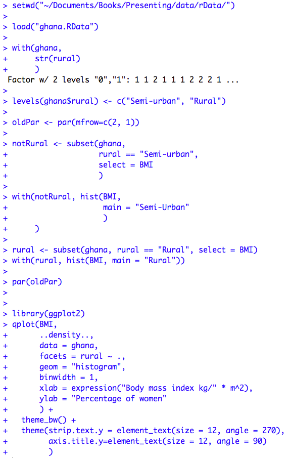
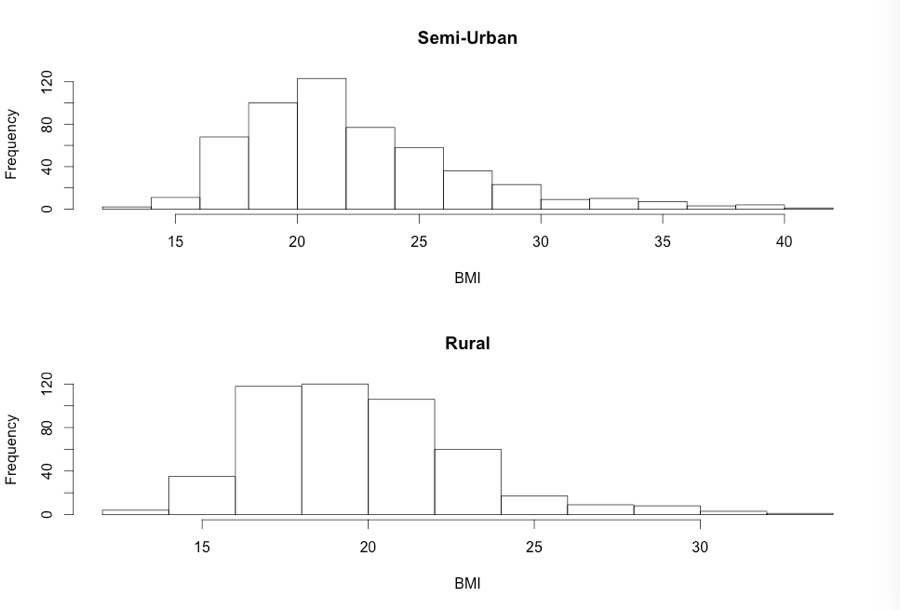
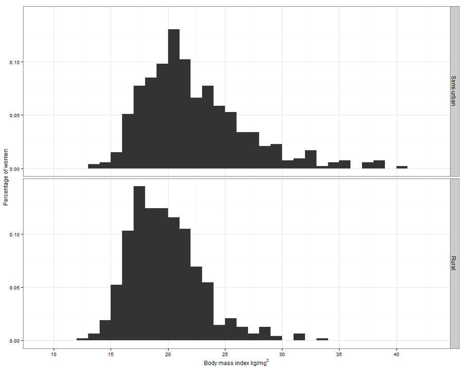
Figure 7.1 Code
Click here to show code with comments# Tell R where you will be working. R will look here for your data: setwd("~/Documents/Books/Presenting/data/rData/") # See chapter 2 for more details on the setwd() funciton. # Use the load() function to load the dataset ghana.RData out of the current # folder/directory into R's interactive working memory/environment. See chapter # 2 for more details. load("ghana.RData") # The with() function, used below, allows you to work with the variables within # a data frame without having to repeatedly mention the data frame. Look at the # long comment about with() in chapter 5 for more details. with(ghana, # Use the ghana data frame. str(rural) # The str() function shows the structure (value/levels) of the ) # variable called rural. # Note that the code above shows that levels will be displayed as 0 and 1. # The levels() function can change the display of the categorical variable to be # semi-urban and rural. The c() function used here can glue together a set of # similar things, for example, a bunch of numbers, to make a vector. The levels # argument is expecting a vector. Remember that the c() function stores similar # things as a vector. In this case, the vector is storing character strings # that are the actual values of the race variable. levels(ghana$rural) <- c("Semi-urban", "Rural") # The par() function can be used to set many options for many graphics (but not # the ggplot2 graphics shown below). To learn more about par() look here: # http://www.statmethods.net/advgraphs/layout.html # http://www.statmethods.net/advgraphs/parameters.html # # From now on, every two plots go into one column in one image. With this syntax # oldPar will automatically store the old values of the mfrow option. oldPar <- par(mfrow=c(2, 1)) # Make a data frame of not rural BMIs. The subset() function takes a data frame # as its first argument. It can use a "logic check" argument, which is actually # called subset, which is used to determine which records/rows/observations to # include for its second argument and a third argument called select which # indicates what variables to keep. notRural <- subset(ghana, # use this data frame # Only select cases where the rural variable is semi-urban # Notice that R uses =?= for logic checks rural == "Semi-urban", select = BMI # Keep only this variable. ) # The hist() function can make basic histograms easily. Here it is making a # histogram of the semi-urban BMIs. with(notRural, hist(BMI, main = "Semi-Urban" # the main title ) ) rural <- subset(ghana, rural == "Rural", select = BMI) with(rural, hist(BMI, main = "Rural")) # Reset graphics to 1 row and column per image. par(oldPar) # The library() function attaches a package full of functions (and sometimes # data frames) to R's "search list". When you type qplot(), R searches that # list to figure out what to do. If you have not attached the package that # included a qplot() function, R will complain that it can not find the # function "qplot". # You can encounter problems when two packages include functions with the same # name. R will give a warning like: # The following object(s) are masked ... # when you attach a package that includes a function that is already in the # search list. R calls this problem masking. The detach() function, shown # below, can be used to remove packages from the search list and help avoid this # problem. # The ggplot2 library contains the commonly used ggplot() and qplot() functions # which can be used to make simple and very complex graphics. The # syntax/grammar used by ggplot2 is somewhat different from the rest of R. The # basic idea with ggplot2 is that you add more and more details to get basic # geometric objects to behave. It, perhaps even more than the rest of R, is # evolving and features get devaluated. To learn more about ggplot2 look here: # http://ggplot2.org/ # http://www.statmethods.net/advgraphs/ggplot2.html library(ggplot2) qplot(BMI, # Do a plot of BMI. ..density.., # The statistic will be a density instead of a count. data = ghana, # Use the ghana dataset. facets = rural ~ ., # Make rows based on rural. geom = "histogram", # The plot is a histogram. binwidth = 1, # Histograms use 1 unit wide bins. # The expression() function can be used to write special characters and # superscripts in R plot axis titles. xlab = expression("Body mass index kg/" * m^2), # Label the x axis with # text that includes an # exponent. # Label the y axis with percentage instead of density. ylab = "Percentage of women" ) + # Add in more features. theme_bw() + # The graphic is optimized for black and white printers. theme(strip.text.y = element_text(size = 12, angle = 270), # font for labels axis.title.y=element_text(size = 12, angle = 90) # font for y label )
Figure 7.2 Overlapping density plots for two groups
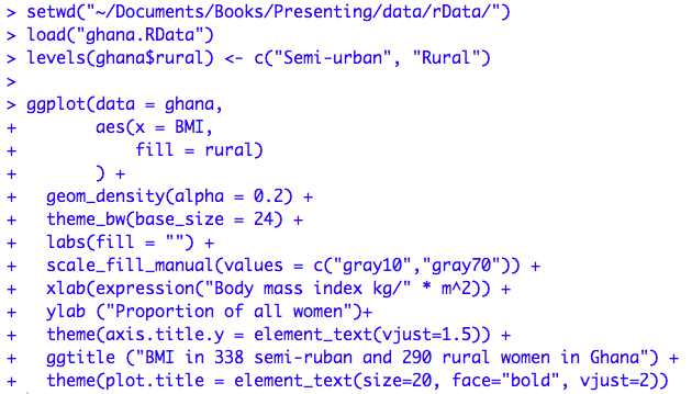
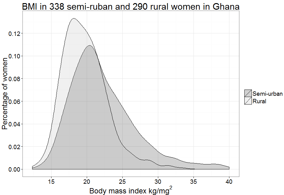
Figure 7.2 Code
Click here to show code with commentssetwd("~/Documents/Books/Presenting/data/rData/") load("ghana.RData") levels(ghana$rural) <- c("Semi-urban", "Rural") ggplot(data = ghana, # Use the ghana dataset. aes(x = BMI, # The x axis aesthetic is BMI. fill = rural) # The fill aesthetic is rural. ) + # Add in more features. geom_density(alpha = 0.2) + # Add a density based on the aesthetics. theme_bw(base_size = 24) + # black and white background with big font labs(fill = "") + # no label for the fill variable above the key scale_fill_manual(values = c("gray10","gray70")) + # fill colors xlab(expression("Body mass index kg/" * m^2)) + # label for x axis ylab ("Proportion of all women") + # label for y axis theme(axis.title.y = element_text(vjust=1.5)) + ggtitle ("BMI in 338 semi-ruban and 290 rural women in Ghana") + theme(plot.title = element_text(size=20, face="bold", vjust=2))
Figure 7.3 Box and whisker plot for a continuous variable in two groups
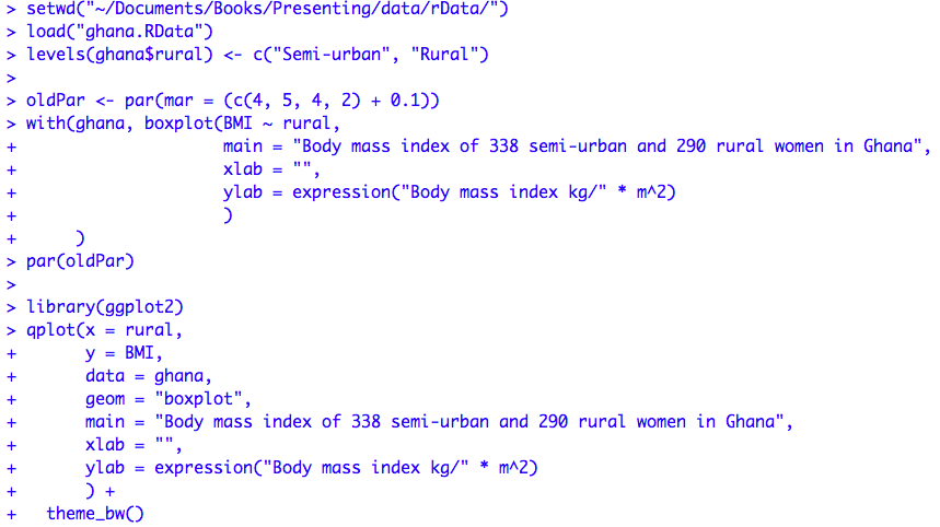
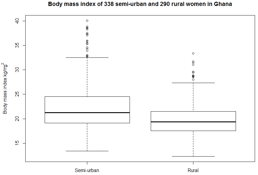
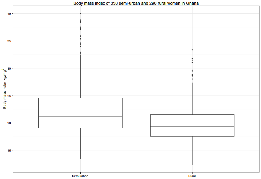
Figure 7.3 Code
Click here to show code with commentssetwd("~/Documents/Books/Presenting/data/rData/") load("ghana.RData") levels(ghana$rural) <- c("Semi-urban", "Rural") oldPar <- par(mar = c(4, 5, 4, 2) + 0.1) # Make left margin 5 wide to fit superscript. with(ghana, boxplot(BMI ~ rural, main = "Body mass index of 338 semi-urban and 290 rural women in Ghana", xlab = "", ylab = expression("Body mass index kg/" * m^2) ) ) par(oldPar) # Reset graphics parameters. # Load the ggplot2 package for the qplot() (quick plot) and ggplot() functions. library(ggplot2) qplot(x = rural, # The x axis shows rural vs. urban. y = BMI, # The y axis shows BMI. data = ghana, # Use the ghana dataset. geom = "boxplot", # The plot is a histogram. main = "Body mass index of 338 semi-urban and 290 rural women in Ghana", xlab = "", ylab = expression("Body mass index kg/" * m^2) ) + # Add in more features. theme_bw()
Figure 7.4 Violin plot for a continuous variable comparing two groups
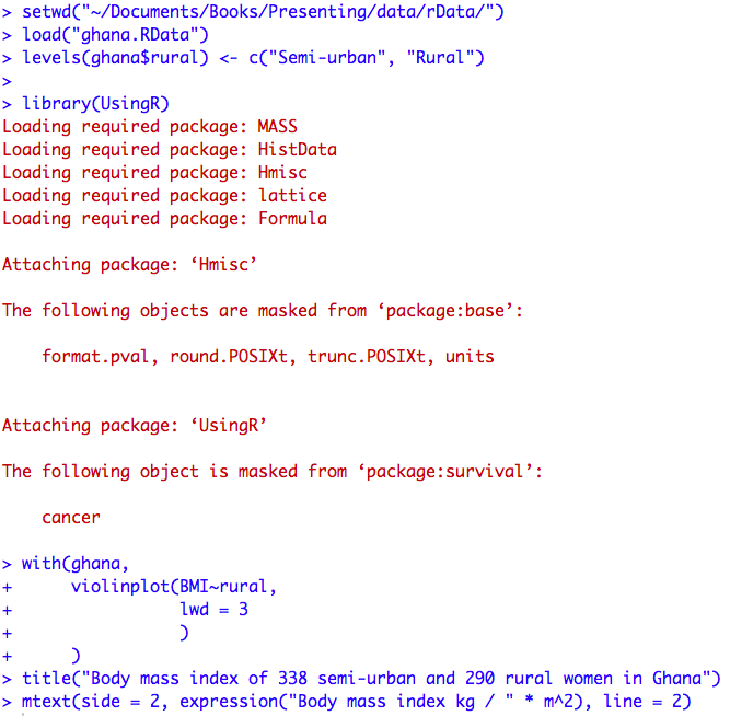
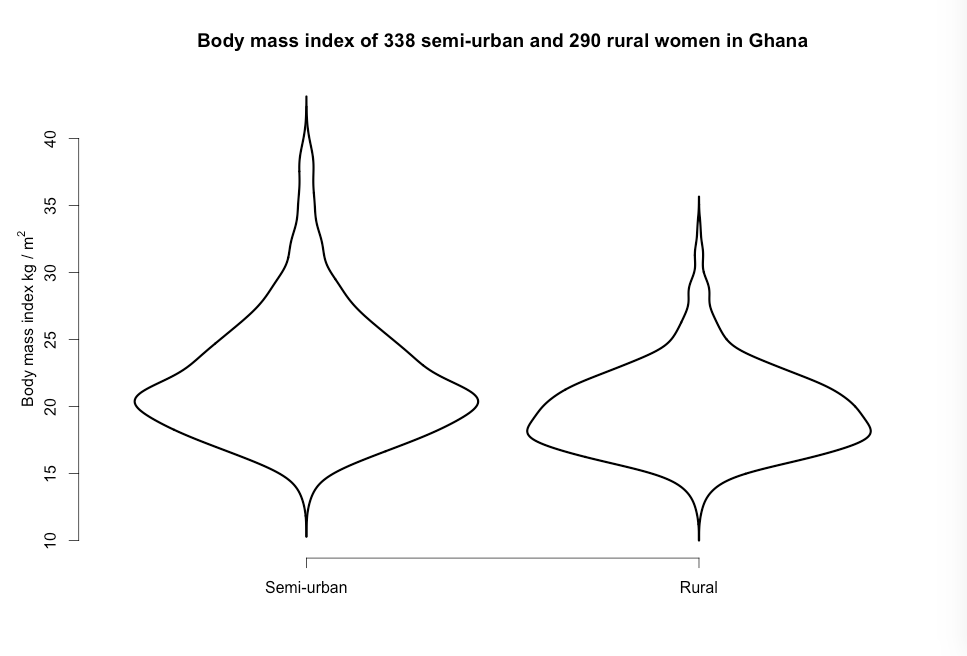
Figure 7.4 Code
Click here to show code with commentssetwd("~/Documents/Books/Presenting/data/rData/") load("ghana.RData") levels(ghana$rural) <- c("Semi-urban", "Rural") # Load the UsingR package to get access to the basic violinplot() function. library(UsingR) with(ghana, # Use the ghana dataset. violinplot(BMI~rural, # Plot BMI on the y axis by rural on the x axis. lwd = 3 # Make the lines extra thick. ) ) # The title() function can add titles to many common plots including graphics # created by the plot() and barplot() functions. To learn more look here: # http://www.statmethods.net/advgraphs/axes.html title("Body mass index of 338 semi-urban and 290 rural women in Ghana") # The mtext() function, like the title() function, can add labels to many common # plots. mtext(side = 2, expression("Body mass index kg / " * m^2), line = 2)
Figure 7.5 Dot plot for a continuous variable comparing two groups
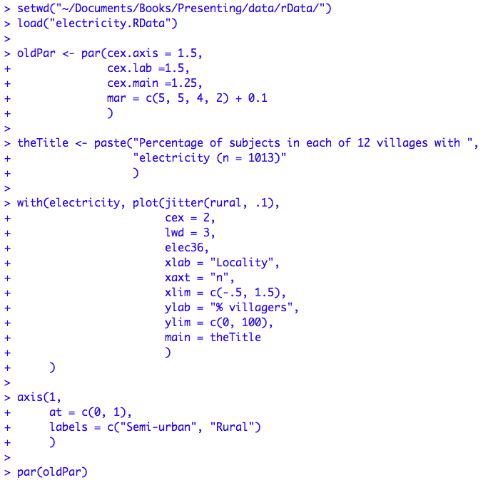
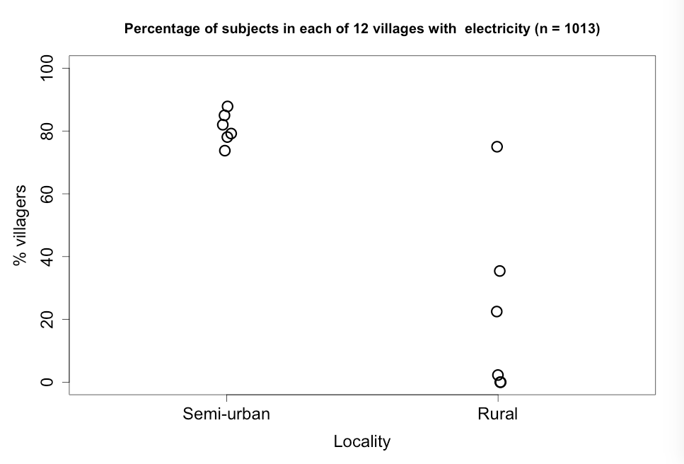
Figure 7.5 Code
Click here to show code with commentssetwd("~/Documents/Books/Presenting/data/rData/") load("electricity.RData") oldPar <- par(cex.axis = 1.5, # Set the size. cex.lab =1.5, cex.main =1.25, mar = c(5, 5, 4, 2) + 0.1 ) # Save current graphics parameters. # The title for the next graphic is extemely long. The entire thing can be # displayed on a big monitor but to have the code display on small monitors, the # parts of the title are written as two separate quoted strings and glued # together using the paste() function. theTitle <- paste("Percentage of subjects in each of 12 villages with ", "electricity (n = 1013)" ) # The plot() function uses the features of the object(s) it is plotting to # figure out what kind of plot to draw. Here, because it is working on a jittered # categorial variable and a vector of numbers, it produces a plot that looks like # a scatterplot. The jitter() function adds a bit of random noise to numeric # variables. It is typically used to avoid overplotting data when there are many # numbers with the same value. with(electricity, plot(jitter(rural, .1), # Jitter/offset x axis values to # avoid overplotting. cex = 2, # Use large plot symbols. lwd = 3, # Use extra thick symbols. elec36, # This is the y axis variable. xlab = "Locality", # Label the x axis. xaxt = "n", # Don't print ticks/values on the # x-axis. It is added below. xlim = c(-.5, 1.5), # Set limits on x axis (to center # values in plot). ylab = "% villagers", # Label the y-axis. ylim = c(0, 100), # Set limits on y-axis values. main = theTitle # Add the title. ) ) # The axis() function adds a custom axis to a previous plot. axis(1, # bottom of page axis at = c(0, 1), # position of ticks labels = c("Semi-urban", "Rural") # tick mark labels ) par(oldPar)
Figure 7.6 Histogram of a variable to check for normality
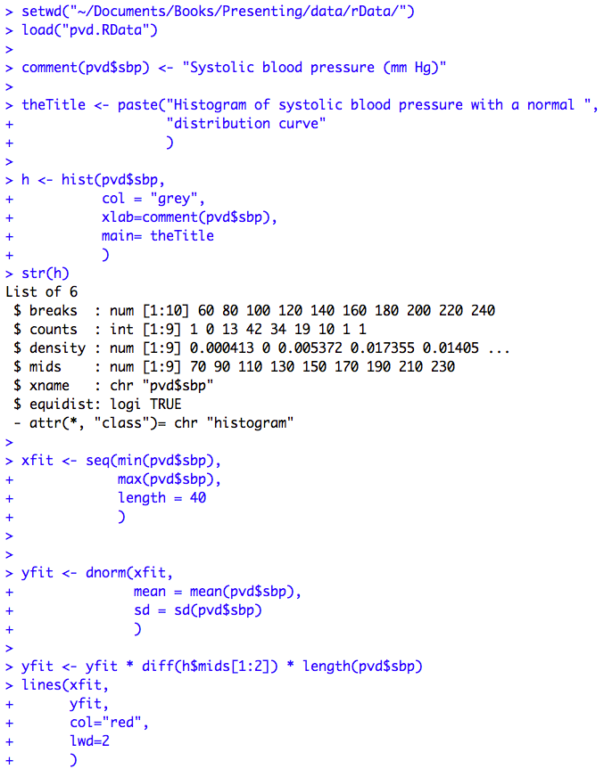
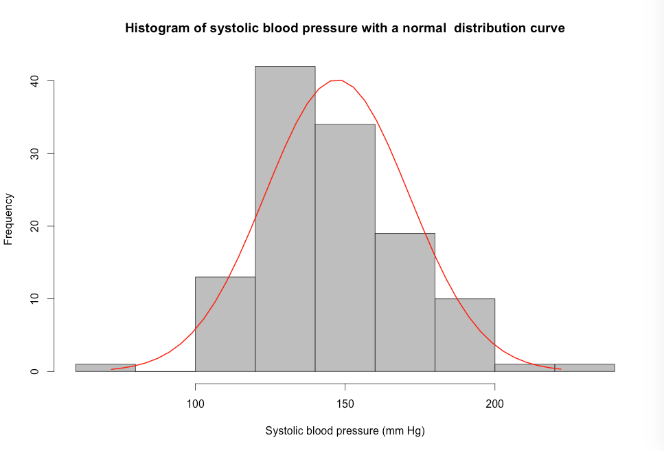
Figure 7.6 Code
Click here to show code with commentssetwd("~/Documents/Books/Presenting/data/rData/") load("pvd.RData") # The comment() function is used to add a descriptive label to the sbp variable # in the pvd data frame. It is not typically automatically shown in output. To # later display the comment, type comment(pvd$sbp). comment(pvd$sbp) <- "Systolic blood pressure (mm Hg)" # Save the long title as a string of characters. theTitle <- paste("Histogram of systolic blood pressure with a normal ", "distribution curve" ) # This plot is based on code that can be found on: # http://www.statmethods.net/graphs/density.html # This code is converted into a function called overlayPlot in chapter 8. Use # that function if you need this plot. # Produce a histogram and save it as an object called h. h <- hist(pvd$sbp, # Use the sbp variable in the pvd data frame. col = "grey", # Label the x-axis with the comment saved above. xlab=comment(pvd$sbp), main= theTitle # Add the title saved above. ) # You can see the details that make the histogram by looking at its structure # using the str() function. Notice that the h object contains objects that hold # details like the position of the breaks, the midpoints and counts. str(h) # The seq() function generates a sequence of numbers. Here the code makes a # vector of 40 numbers that span the range from the smallest to largest sbp # values. The height of the bell shaped curve will be estimated at these # values. xfit <- seq(min(pvd$sbp), # The min() function returns the smallest number in # a vector. max(pvd$sbp), # The max() function returns the largest number in a # vector. length = 40 # This specifies how many values to include in the # vector. ) # Make a vector of density measurements based on the mean and standard deviation # of the sbp values. yfit <- dnorm(xfit, mean = mean(pvd$sbp), # The mean() function returns the mean of a # vector. sd = sd(pvd$sbp) # The sd() function returns the standard # deviation of a vector. ) # This applies a clever rescaling to have the density show. # The diff() function calculates the difference between the first two # midpoints in the h object. The length() function returns the count of numbers # in the vector. yfit <- yfit * diff(h$mids[1:2]) * length(pvd$sbp) # The lines() function draws a line on a graphic. lines(xfit, # the x-axis value yfit, # the y-axis value col="red", # the line color lwd=2 # Make the line thick. )
Figure 7.7 Output for an unpaired t-test
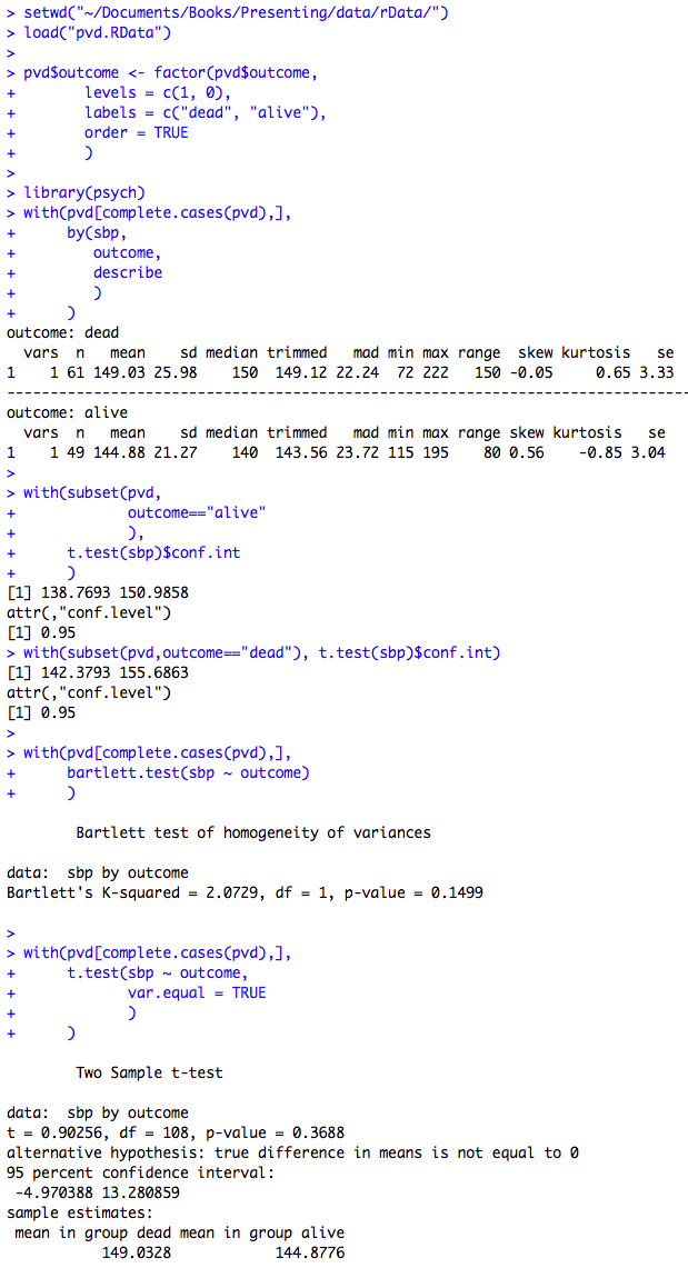
Figure 7.7 Code
Click here to show code with commentssetwd("~/Documents/Books/Presenting/data/rData/") load("pvd.RData") # Set the order of the levels to get dead - alive for confidence interval. pvd$outcome <- factor(pvd$outcome, levels = c(1, 0), labels = c("dead", "alive"), order = TRUE ) library(psych) # Load psych to get its describe() function. with( # The complete.cases() function returns a vector or true/false values for # each record depending on if there is any missing data. Code says use pvd # dataset. The values in the square brackets indicate: # [ which which rows to include , all columns ] # The true/false vector selects the records without missing data. pvd[complete.cases(pvd),], # The by() function lets you easily produce statistics which are grouped # by a subgrouping variable. by(sbp, # Process this variable. outcome, # Group data by this variable. describe # Use the describe() function for basic stats. ) ) # Use all records in pvd where the outcome = alive. with(subset(pvd, outcome=="alive" ), # Use the t.test() function to see if sbp is different from 0 and # only keep the confidence intervals around the observed sbp. The conf.int # attribute is one of many features that make the output object. The # t.test() function produces an object that has many attributes. You can # see a summary of the attributes and their values by typing: # str(t.test(pvd$sbp)) t.test(sbp)$conf.int ) with(subset(pvd, outcome=="dead"), t.test(sbp)$conf.int ) with(pvd[complete.cases(pvd),], # The bartlett.test() function is used to test for differences in variance # between outcome levels. If the p-value < .05 or lower, use var.equal = # FALSE in t-test. If there is any doubt, use an unequal variance t-test. bartlett.test(sbp ~ outcome) ) with(pvd[complete.cases(pvd),], t.test(sbp ~ outcome, # difference in sbp based on outcome var.equal = TRUE # Many people drop this and use Welch t-test. ) )
Figure 7.8 Histograms of a skewed variable before and after log transformation
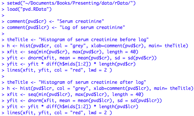
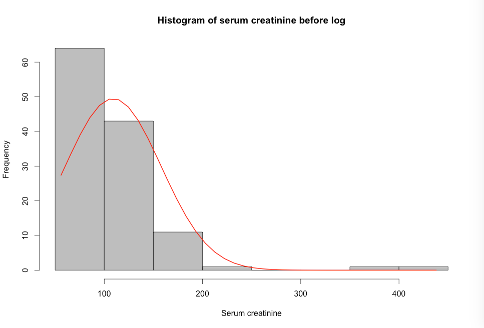
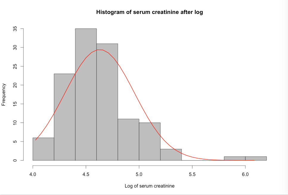
Figure 7.8 Code
Click here to show code with commentssetwd("~/Documents/Books/Presenting/data/rData/") load("pvd.RData") comment(pvd$cr) <- "Serum creatinine" comment(pvd$lcr) <- "Log of serum creatinine" # Save the long title as a string of characters. theTitle <- "Histogram of serum creatinine before log" # This plot is based on code that used to be found on: # http://www.statmethods.net/graphs/density.html # See the code above for details. h <- hist(pvd$cr, col = "grey", xlab=comment(x), main= theTitle) xfit <- seq(min(pvd$cr), max(pvd$cr), length = 40) yfit <- dnorm(xfit, mean = mean(pvd$cr), sd = sd(pvd$cr)) yfit <- yfit * diff(h$mids[1:2]) * length(pvd$cr) lines(xfit, yfit, col = "red", lwd = 2 ) theTitle <- "Histogram of serum creatinine after log" h <- hist(pvd$lcr, col = "grey", xlab=comment(x), main= theTitle) xfit <- seq(min(pvd$lcr), max(pvd$lcr), length = 40) yfit <- dnorm(xfit, mean = mean(pvd$lcr), sd = sd(pvd$lcr)) yfit <- yfit * diff(h$mids[1:2]) * length(pvd$lcr) lines(xfit, yfit, col = "red", lwd = 2 )
Figure 7.9 Output for back transforming t-test data
Box 7.4 Presenting the findings of a t-test on log-transformed data
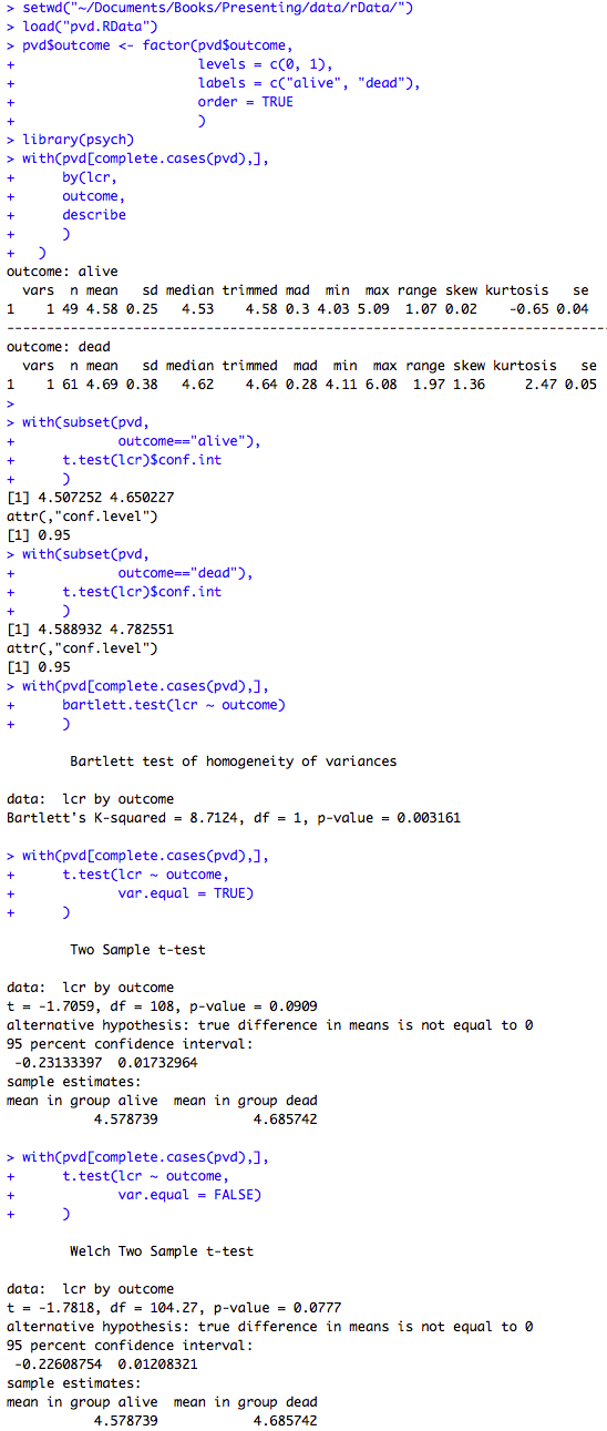
Figure 7.9 Code and Box 7.4
Click here to show code with commentssetwd("~/Documents/Books/Presenting/data/rData/") load("pvd.RData") pvd$outcome <- factor(pvd$outcome, levels = c(1, 0), labels = c("dead", "alive"), order = TRUE ) library(psych) # Load psych to get its describe() function. with( # The complete.cases() function returns true/false for each record depending # on if there is any missing data. Code says use pvd dataset [ choose # records where there is no missing data , all columns ] pvd[complete.cases(pvd),], by(lcr, # Process this variable. outcome, # Group data by this variable. describe # Use this function. ) ) # Take all records in pvd where the outcome = alive. with(subset(pvd, outcome=="alive"), # The t.test() function can be used to test whether lcr is different from 0 # and only keep the confidence intervals around the observed lcr. t.test(lcr)$conf.int) with(subset(pvd,outcome=="dead"), t.test(lcr)$conf.int ) with(pvd[complete.cases(pvd),], bartlett.test(lcr ~ outcome) ) with(pvd[complete.cases(pvd),], t.test(lcr ~ outcome, # Test the difference in lcr based on outcome. var.equal = TRUE) # If you want to assume the variances are equal ) # use this. with(pvd[complete.cases(pvd),], t.test(lcr ~ outcome, # The variances are not the same so use this. var.equal = FALSE) )
Figure 7.10 Table of data for and output from a Mann-Whitney U test
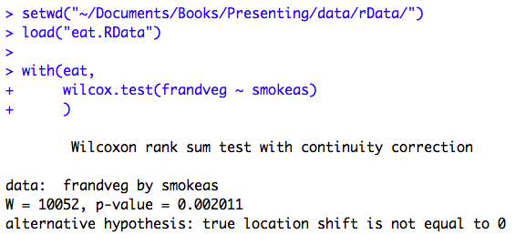
Figure 7.10 Code
Click here to show code with commentssetwd("~/Documents/Books/Presenting/data/rData/") load("eat.RData") # The wilcox.test() function is used to produce the Mann - Whitney U which is # also known as the Wilcoxon rank-sum test. with(eat, # Use the eat dataset. wilcox.test(frandveg ~ smokeas) # Predict frandveg with smokeas. )
Figure 7.11 Output for chi-square test relative risk and risk difference
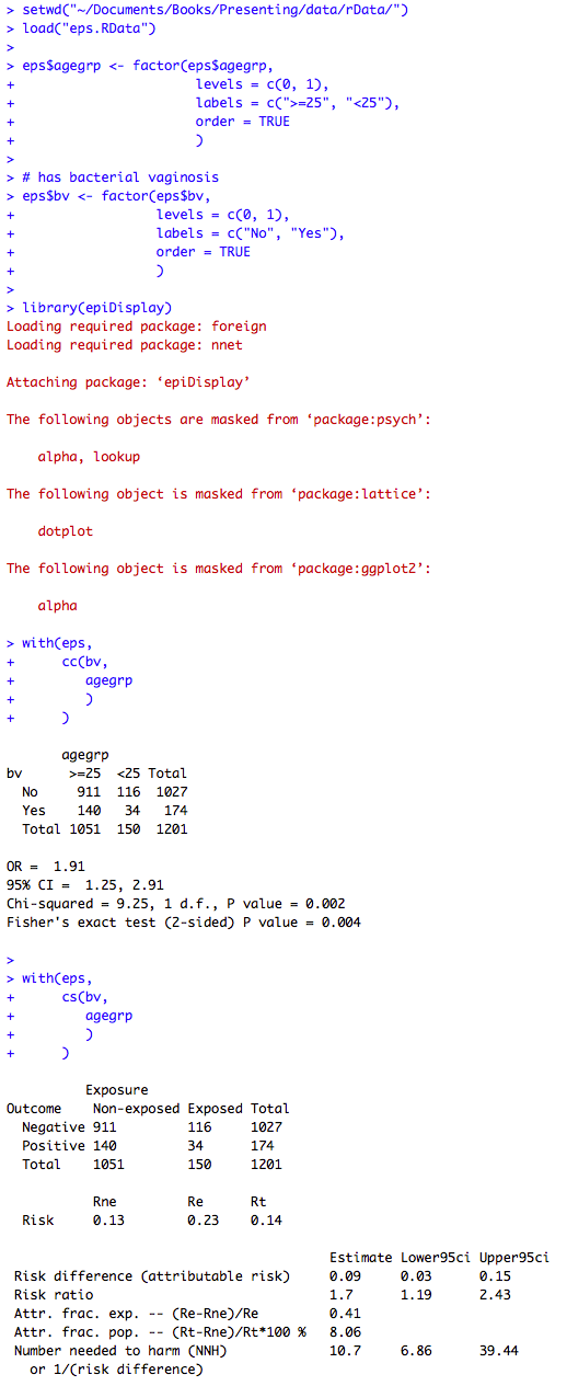
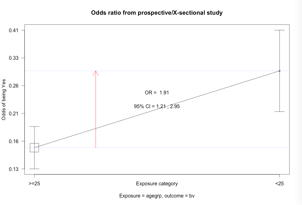
Figure 7.11 Code
Click here to show code with commentssetwd("~/Documents/Books/Presenting/data/rData/") load("eps.RData") eps$agegrp <- factor(eps$agegrp, levels = c(0, 1), labels = c(">=25", "<25"), order = TRUE ) # has bacterial vaginosis eps$bv <- factor(eps$bv, levels = c(0, 1), labels = c("No", "Yes"), order = TRUE ) # Use the epiDisplay library to access the cc() function. library(epiDisplay) # Use the cc() function to calculate an odds ratio with exact CL, chi-square and # Fisher's exact test. with(eps, # case-control studies cc(bv, # outcome 1 = yes agegrp # predictor 1 = yes ) ) # Calculate risk difference (attributable risk), risk ratio, attributable # fraction in exposed, and number needed to harm. with(eps, # cohort and cross-sectional studies cs(bv, # outcome 1 = yes agegrp # predictor 1 = yes ) )
Figure 7.12 Output for odds ratio
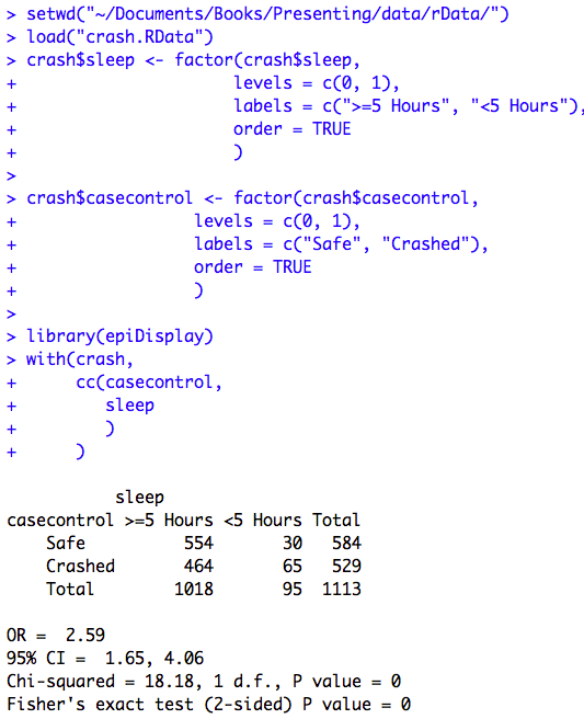
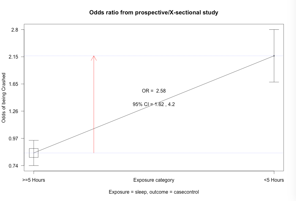
Figure 7.12 Code
Click here to show code with commentssetwd("~/Documents/Books/Presenting/data/rData/") load("crash.RData") crash$sleep <- factor(crash$sleep, levels = c(0, 1), labels = c(">=5 Hours", "<5 Hours"), order = TRUE ) # has bacterial vaginosis crash$casecontrol <- factor(crash$casecontrol, levels = c(0, 1), labels = c("Safe", "Crashed"), order = TRUE ) # Use the epiDisplay library to access the cc() function. library(epiDisplay) with(crash, # case-control studies cc(casecontrol, # outcome 1 = yes sleep # predictor 1 = yes ) )
Table 7.1 Presenting ordered proportions
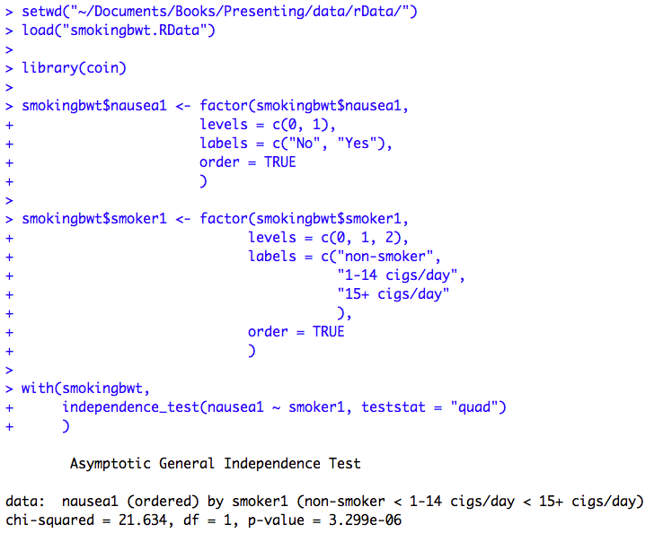
Table 7.1 Code
Click here to show code with commentssetwd("~/Documents/Books/Presenting/data/rData/") load("smokingbwt.RData") # Use the coin library to access the independence_test() function. library(coin) smokingbwt$nausea1 <- factor(smokingbwt$nausea1, levels = c(0, 1), labels = c("No", "Yes"), order = TRUE ) # has bacterial vaginosis smokingbwt$smoker1 <- factor(smokingbwt$smoker1, levels = c(0, 1, 2), labels = c("non-smoker", "1-14 cigs/day", "15+ cigs/day" ), order = TRUE ) with(smokingbwt, # Use the independence_test() function to do a Cochran-Armitage trend test # for proportions. independence_test(nausea1 ~ smoker1, teststat = "quad") )