Home > Output
Chapter 7: Comparing two groups using STATA
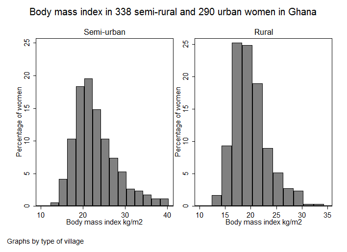
Figure 7.1 Histogram of two groups on one graph

Figure 7.1 Code

Click here to show code as text
use "C:\Projects\Books\Presenting\data\stataData\ghana.dta", clear

label variable rural "type of village"
label define rural 1 "Rural" 0 "Semi-urban"
label values rural rural

histogram bmi if sex==1, width(2) percent ytitle(Percentage of women) ///
	ylabel(0(5)25) xtitle(Body mass index kg/m2) ///
	by(, title(Body mass index in 338 semi-rural and 290 urban women in Ghana, size(medium) span) ///
	note(, color(none) nobox)) by(, legend(off)) by(rural, style(combine) imargin(zero) colfirst)
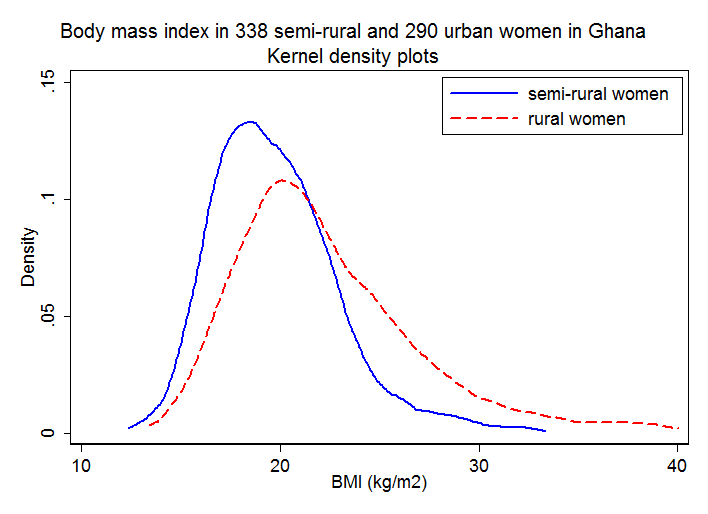
Figure 7.2 Two pannel or overlapping density plots for two groups

Figure 7.2 Code

Click here to show code as text
use "C:\Projects\Books\Presenting\data\stataData\ghana.dta", clear
twoway kdensity bmi if rural, xtitle("BMI (kg/m2)") ytitle(Density) ///
title(Body mass index in 338 semi-rural and 290 urban women in Ghana, size(medium) span) ///
subtitle(Kernel density plots, size(medium small) span) ///
color(blue*.5) lcolor(blue)  lwidth(medthick)  || ///
kdensity bmi if !rural ,    ///
color(red*.1) lcolor(red) lpattern(dash) lwidth(medthick) ///
legend(order(1 "semi-rural women" 2 "rural women") col(1) pos(1) ring(0))
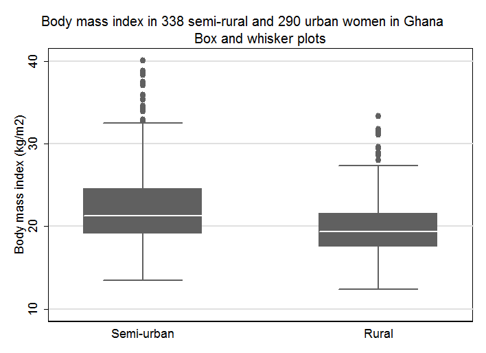
Figure 7.3 Box and whisker plot for a continuous variable in two groups

Figure 7.3 Code

Click here to show code as text
use "C:\Projects\Books\Presenting\data\stataData\ghana.dta", clear

label variable rural "type of village"
label define rural 1 "Rural" 0 "Semi-urban"
label values rural rural

graph box bmi, over(rural) ytitle(Body mass index (kg/m2)) ///
title(Body mass index in 338 semi-rural and 290 urban women in Ghana, size(medium) span) ///
subtitle(Box and whisker plots, size(medium)) legend(off)
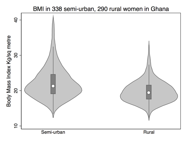
Figure 7.4 Violin plot for a continuous variable comparing two groups

Figure 7.4 Code

Click here to show code as text
** type 'help vioplot' to see if this package is installed
** if not follow instructions to install into c:\ado\plus
** ssc install vioplot


use "C:\Projects\Books\Presenting\data\stataData\ghana.dta", clear

label define rural_label 0 "Semi-urban" 1 "Rural"
label values rural rural_label

vioplot bmi, over( rural) title("BMI in 338 semi-urban, 290 rural women in Ghana") ///
ytitle("Body Mass Index Kg/sq metre")
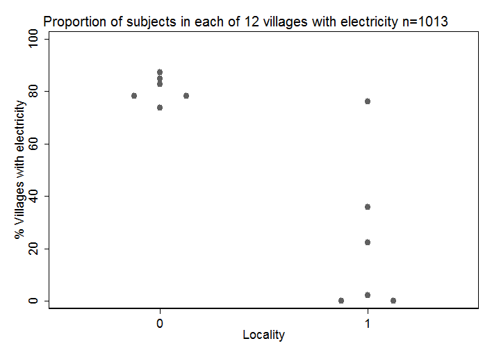
Figure 7.5 Dot plot for a continuous variable comparing two groups

Figure 7.5 Code

Click here to show code as text
use "C:\Projects\Books\Presenting\data\stataData\electricity.dta", clear

* first collapse the data set to give % with electricty by village
collapse (mean) elec36 rural, by(village)

label values rural rural
label variable rural "Locality"
label variable elec36 "% Villages with electricity"

dotplot  elec36, over(rural) center ///
	ylabel(0 20 40 60 80 100)  ///
	title("Proportion of subjects in each of 12 villages with electricity n=1013", size(mediumsmall) span)
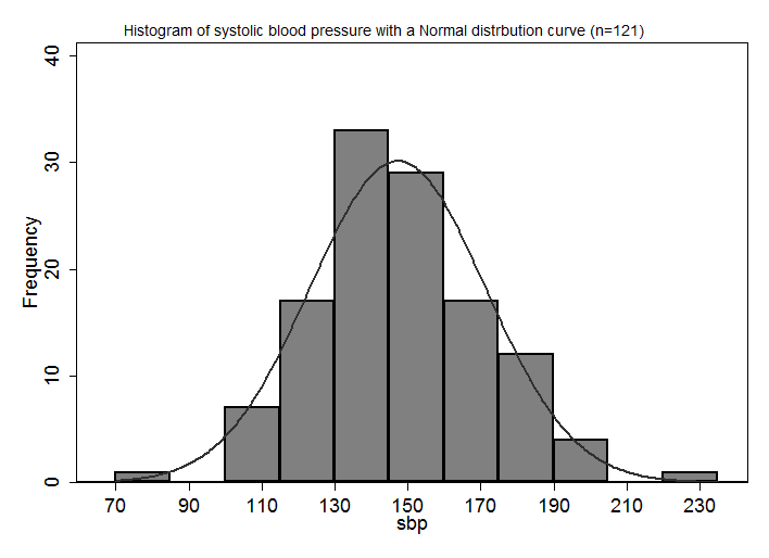
Figure 7.6 Histogram of a variable to check for normality

Figure 7.6 Code

Click here to show code as text
 use "C:\Projects\Books\Presenting\data\stataData\pvd.dta", clear

 histogram sbp, width(15) start(70) frequency normal xlabel(70(20)240) ///
	title(Histogram of systolic blood pressure with a Normal distrbution curve (n=121), size(small) span)
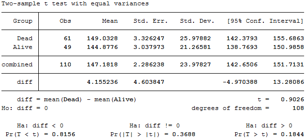
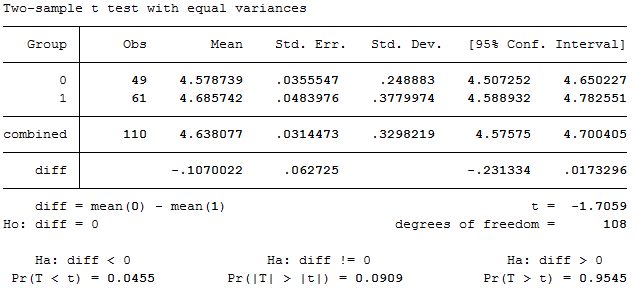
Figure 7.7 Output for an unpaired t-test

Figure 7.7 Code

Click here to show code as text
use "C:\Projects\Books\Presenting\data\stataData\pvd.dta", clear
recode outcome 0=1 1=0
label define outcome 1 "Alive" 0 "Dead", replace
label values outcome outcome
ttest sbp , by(outcome)
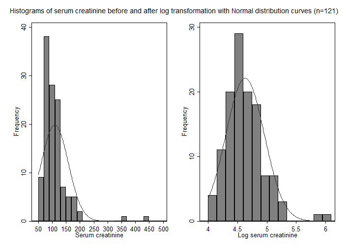
Figure 7.8 Histograms of a skewed variable before and after log transformation

Figure 7.8 Code

Click here to show code as text
use "C:\Projects\Books\Presenting\data\stataData\pvd.dta", clear

label variable cr "Serum creatinine"
label variable lcr "Log serum creatinine"

 **1st create each graph separately

 histogram cr, width(20) start(50) frequency normal xlabel(50(50)500) title(, size(small) span)
 graph save Graph "C:\blah\fig7.8a.gph"  // replace needed if the graphic exists

 histogram lcr, width(.15) start(4) frequency normal ///
	xlabel(4(.5)6) title(, size(small) span)
	graph save Graph "C:\blah\fig7.8b.gph"  // replace needed if the graphic exists

 ** now combine two graphs

 graph combine "C:\blah\fig7.8a.gph" "C:\blah\fig7.8b.gph", ///
 title(Histograms of serum creatinine before and after log transformation with Normal distribution curves (n=121), size(small) span)
Figure 7.9 Output for back transforming t-test data
Box 7.4 Presenting the findings of a t-test on log-transformed data

Figure 7.9 Code and Box 7.4

Click here to show code as text
use "C:\Projects\Books\Presenting\data\stataData\pvd.dta", clear
ttest lcr, by(outcome)
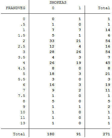
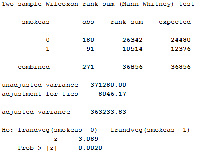
Figure 7.10 Table of data for and output from a Mann-Whitney U test


Figure 7.10 Code

Click here to show code as text
use "C:\Projects\Books\Presenting\data\stataData\eat.dta", clear
tabulate frandveg smokeas
ranksum frandveg, by(smokeas)
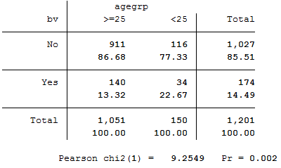
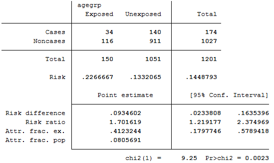
Figure 7.11 Output for chi-square test relative risk and risk difference


Figure 7.11 Code

Click here to show code as text
use "C:\Projects\Books\Presenting\data\stataData\eps.dta", clear

label define bv 0 "No" 1 "Yes", replace
label values bv bv
label define age 0 ">=25" 1 "<25", replace
label values age age

tabulate bv age, col chi2

cs bv age
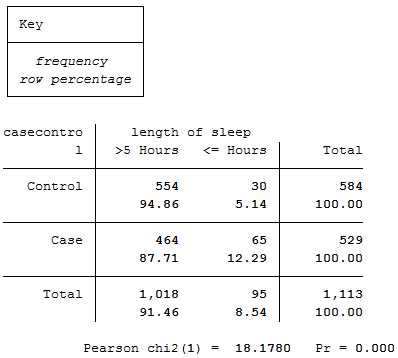
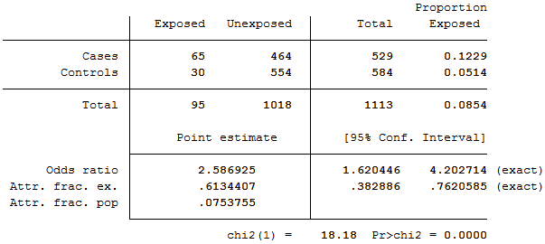
Figure 7.12 Output for odds ratio


Figure 7.12 Code

Click here to show code as text
use "C:\Projects\Books\Presenting\data\stataData\crash.dta", clear
label define sleep 0 ">5 Hours" 1 "<= Hours", replace
label values sleep sleep
label define case 0 "Control" 1 "Case", replace
label values case case
tabulate case sleep, row chi2
cc case sleep
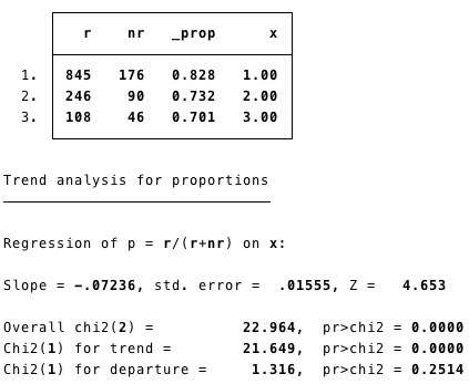
Table 7.1 Presenting ordered proportions

Table 7.1 Code

Click here to show code as text
** the chisquared test for trend isn't in Stata but a user package ptrend can be installed
** to find the pacakge, type 'findit ptrend'
ssc install ptrend

** we use the immediate form here for ease
** note these can be calculated from Table 7.1 as 845, 1021-845 etc
** the x1, x2 etc indicate trhe weighting for the categories. we will use 1,2,3

ptrendi 845 176 1\246 90 2\108 46 3
