Chapter 9: Analysing matched or paired data using R
Figure 9.1 Scatterplot for two variables
Figure 9.2 Output for Pearson’s correlation
Box 9.3 Presenting the results for Pearson’s correlation
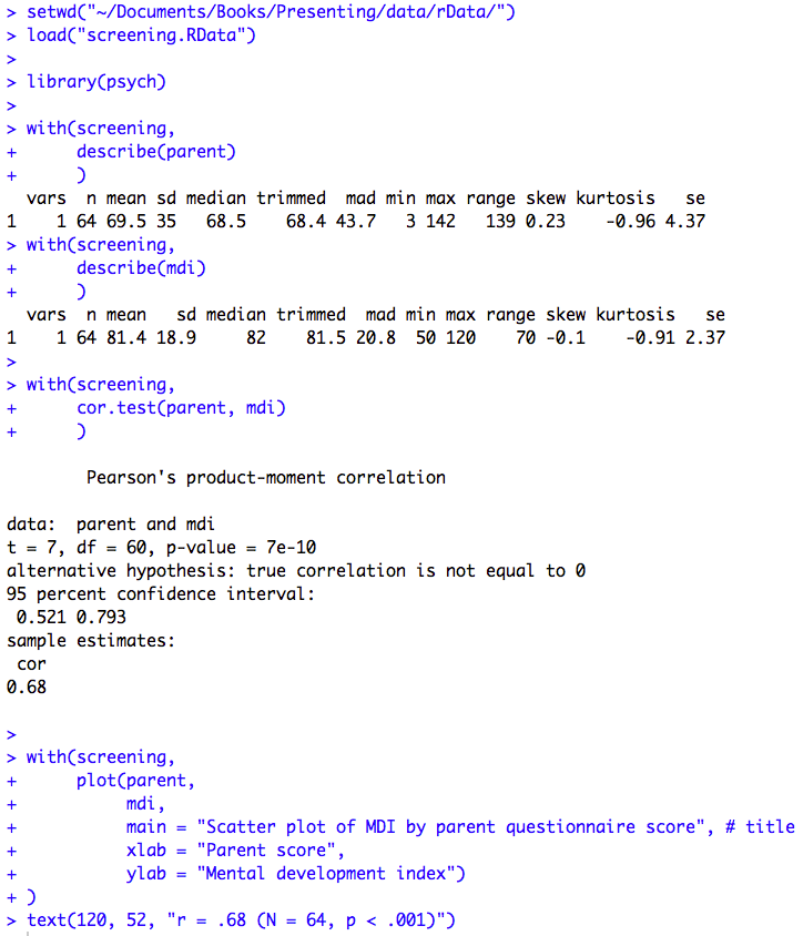
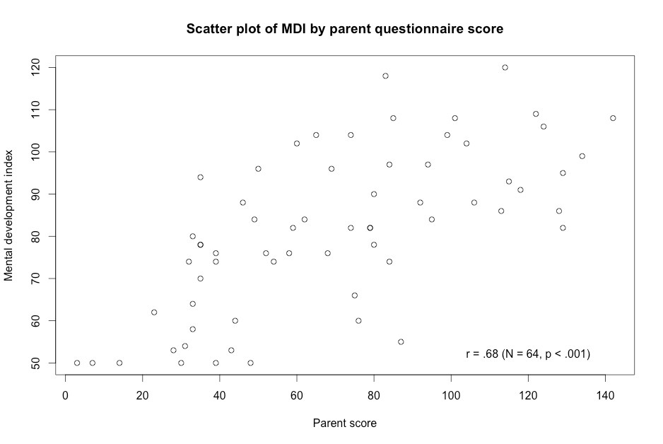
Figure 9.1 Code
Click here to show code with comments# Tell R where you will be working. R will look here for your data: setwd("~/Documents/Books/Presenting/data/rData/") # See chapter 2 for more details on the setwd() function. # Use the load() function to load the dataset screening.RData out of the current # folder/directory into R's interactive working memory/environment. See chapter # 2 for more details. load("screening.RData") # Use the library() function to load the psych package for the describe() # function. See chapter 2 for more details on library(). library(psych) # The describe() funcion in the psych package does descriptive statistics # including a standard deviation. See chapter 2 for more details. Chapter 2 # also covers the with() function. with(screening, describe(parent) ) with(screening, describe(mdi) ) with(screening, # The cor.test() function calculates many correlation coefficients # including the Pearson correlation coefficient. cor.test(parent, mdi) ) with(screening, # Use the plot() function to make a scatterplot for parent and mdi. Plot() # makes a scatterplot by default for two integer variables. See chapter 7 # for more details. plot(parent, mdi, main = "Scatter plot of MDI by parent questionnaire score", # title xlab = "Parent score", ylab = "Mental development index") ) # The text() function can be used to add annotation to plots produced by the # plot() function. The first argument gives the x-axis location, the second # is used for the y-axis and the third is the text that is added to the plot. text(120, 52, "r = .68 (N = 64, p < .001)") # Center extra text at (120, 52).
Figure 9.3 Scatterplots for several variables
Figure 9.4 Calculating several correlations
Box 9.5 Presenting correlations between several variables
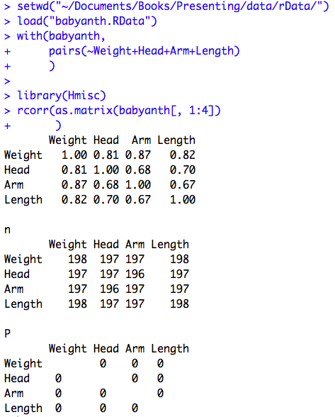
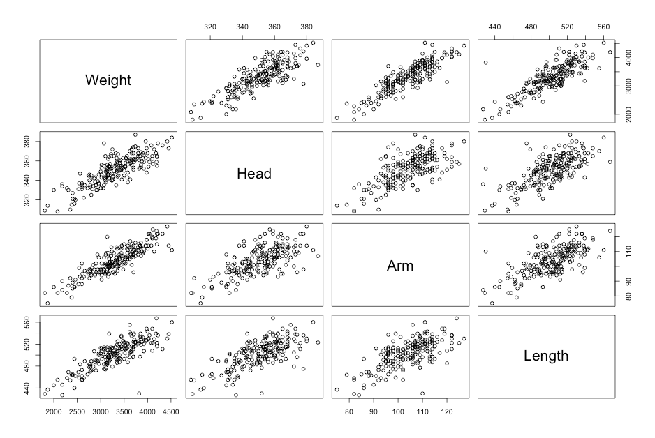
Figure 9.3, Figure 9.4 and Box 9.5 Code
Click here to show code with commentssetwd("~/Documents/Books/Presenting/data/rData/") load("babyanth.RData") with(babyanth, # The pairs() function produces a scatterplot matrix. Type ?pairs and look # in the Examples section to see the syntax. pairs(~Weight+Head+Arm+Length) # Scatterplot matrix with all 4 variables ) # Load the Hmisc package to use the rcorr() function. By default, it returns # a set of matricies holding Pearson's r, the sample size, and p values. library(Hmisc) # The rcorr() function expects a matrix for its first argument. The as.matrix() # function coerces four select columns of the babyanth data frame to be a matrix # object. The [ ] notation is used to filter a data frame. Here the [, # indicates that there are no filters on the rows and 1:4] indicates that only # the first 4 columns in the data frame are being used. rcorr(as.matrix(babyanth[, 1:4]) # Use columns 1 to 4 in the correlation matrix. )
Figure 9.5 Presenting scatterplots (a) with skewed data and (b) where data are transformed
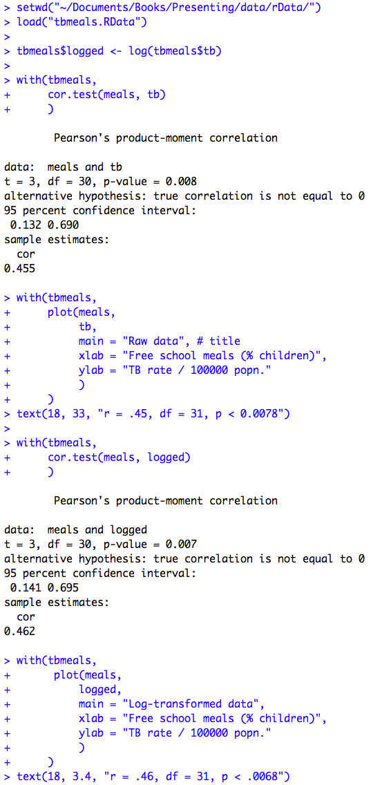
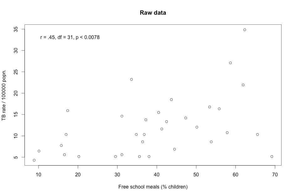
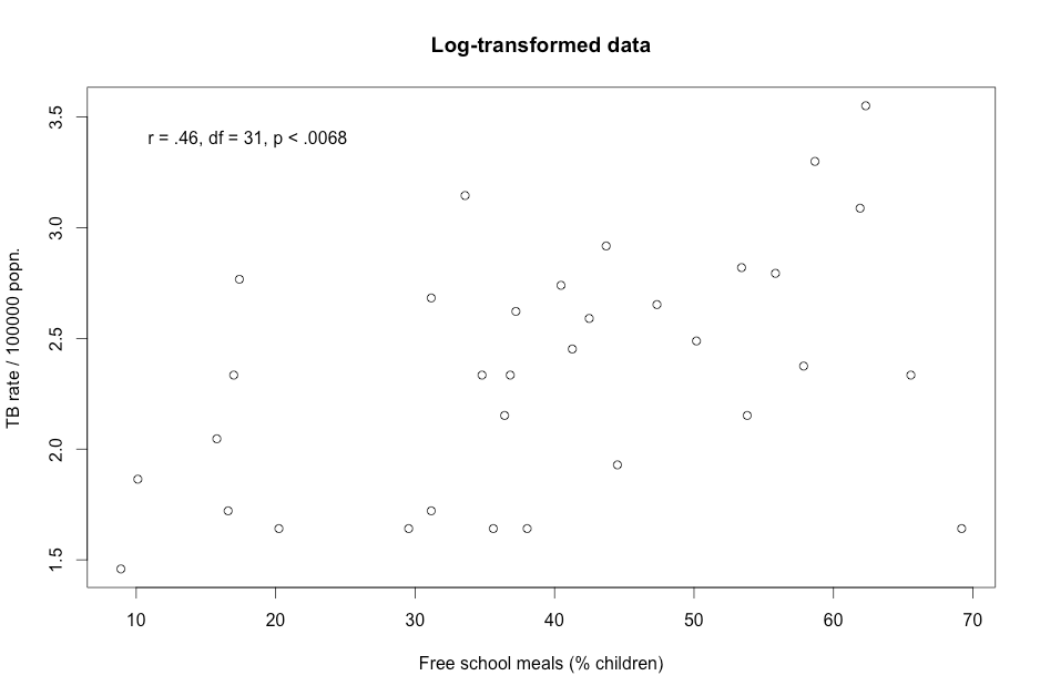
Figure 9.5 Code
Click here to show code with commentssetwd("~/Documents/Books/Presenting/data/rData/") load("tbmeals.RData") tbmeals$logged <- log(tbmeals$tb) with(tbmeals, cor.test(meals, tb) # Do a Pearson correlation. ) with(tbmeals, # Plot parent by mdi. The plot() function makes a scatterplot by default # for two numeric variables. plot(meals, tb, main = "Raw data", # title xlab = "Free school meals (% children)", ylab = "TB rate / 100000 popn.") ) text(18, 33, "r = .45, df = 31, p < 0.0078") # Center extra text at (18, 33). with(tbmeals, cor.test(meals, logged) ) with(tbmeals, # Make a scatterplot of the parent by mdi variables. plot(meals, logged, main = "Log-transformed data", xlab = "Free school meals (% children)", ylab = "TB rate / 100000 popn.") ) text(18, 3.4, "r = .46, df = 31, p < .0068") # Center extra text at (18, 3.4).
Figure 9.6 Output for a rank test
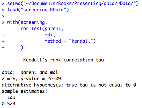
Figure 9.6 Code
Click here to show code with comments
Figure 9.7 Scatterplot of two variables with linear regression line
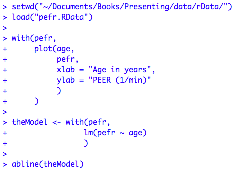
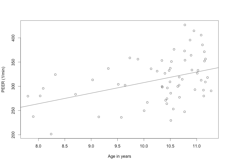
Figure 9.7 Code
Click here to show code with commentssetwd("~/Documents/Books/Presenting/data/rData/") load("pefr.RData") with(pefr, # Make a scatterplot. plot(age, pefr, xlab = "Age in years", ylab = "PEER (1/min)" ) ) # Predict pefr with age and save the results as an object called theModel with # the lm() function. That object will be of class lm and will have many useful # attributes including the details on the modeling, the coefficients, the # residuals, etc. You can plot an object that is a lm with a statement like # plot(theModel) to get diagnostic plots. Other useful functions like # summary() and confint() are shown below. theModel <- with(pefr, # The lm() function can be used to fit a linear regression # model. The first argument is a formula which is written as # the outcome/dependent variable/predicted, then a tilde, then # the independent variable(s)/predictor(s). The syntax for the # models can become complex. lm(pefr ~ age) ) # The abline() function adds lines to a previous plot. Here it is passed the # lm object called theModel. When you pass abline a lm model, which is a simple # linear regression, it will use the regression formula to set the slope and # intercept for the line. abline(theModel) # Add a regression line based on the model.
Figure 9.8 Output for simple regression
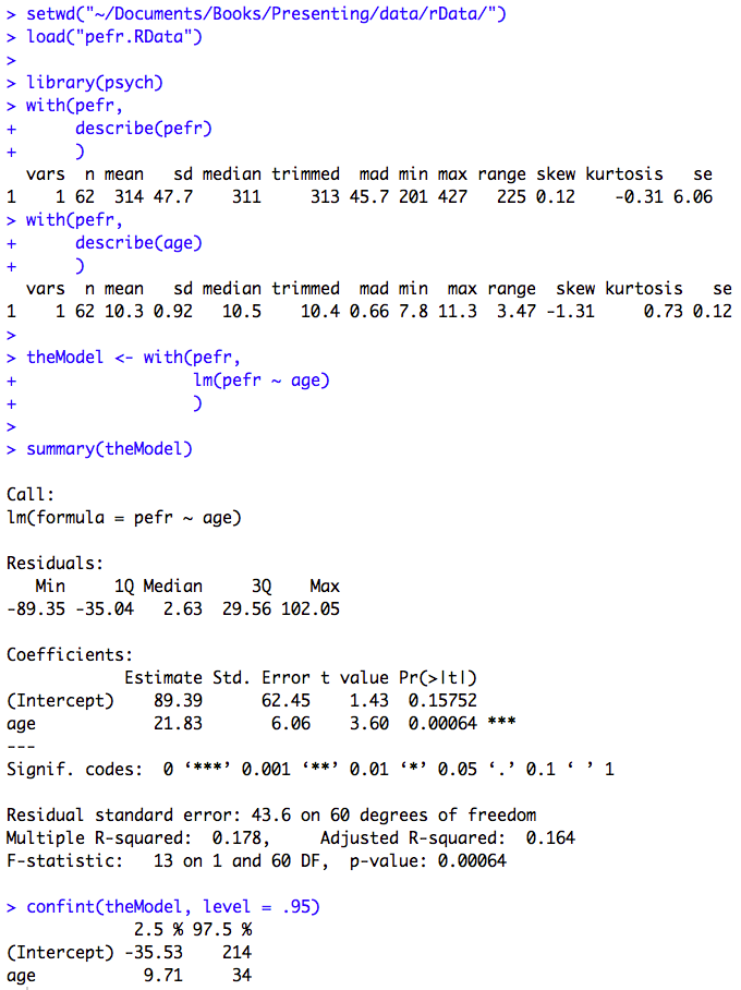
Figure 9.8 Code
Click here to show code with commentssetwd("~/Documents/Books/Presenting/data/rData/") load("pefr.RData") # Load the psych package for the describe() function. library(psych) with(pefr, describe(pefr) # Describe the outcome variable. ) with(pefr, describe(age) # Describe the predictor variable. ) # Predict pefr with age and save the results as an object called theModel. theModel <- with(pefr, lm(pefr ~ age) ) # The summary() function pays attention to the type of object it is summarizing. # Recall from chapter 2 that summary() does five number summaries on a data # frame. Here the object is a linear model. You can see that by typing: # class(theModel) # Because the class is "lm", summary gives different details including the model # code that was submitted, the residuals, the coefficients and a few statistics. summary(theModel) # Print a summary of the model. confint(theModel, level = .95) # Print 95% CLs on the model coefficients.
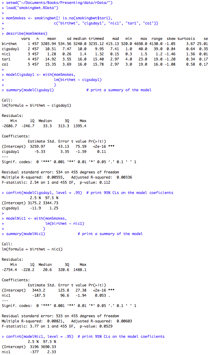
Box 9.11 Presenting the results for several predictor variables
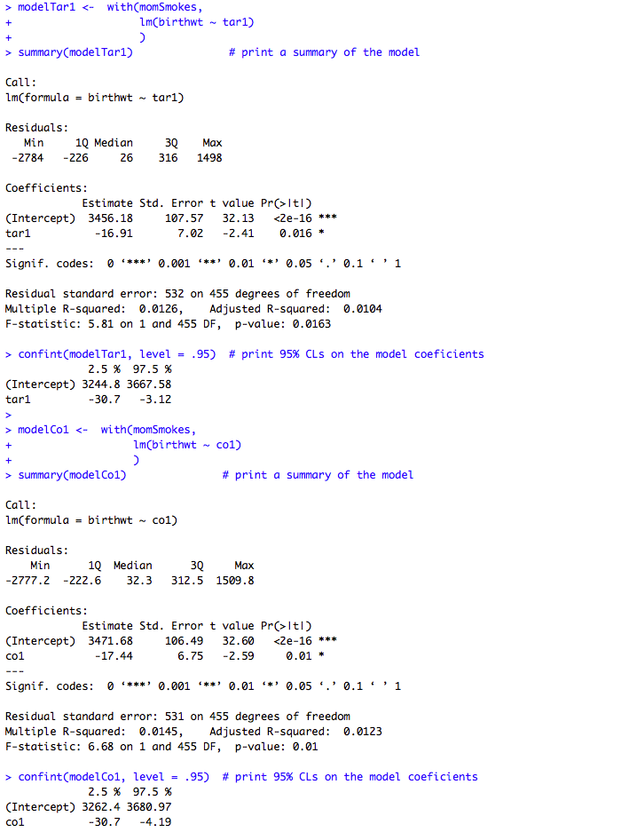
Box 9.11 Code
Click here to show code with commentssetwd("~/Documents/Books/Presenting/data/rData/") load("smokingbwt.RData") # Select five columns where the rows are not missing tar. momSmokes <- smokingbwt[! is.na(smokingbwt$tar1), c("birthwt", "cigsday1", "nic1", "tar1", "co1") ] describe(momSmokes) # Use the mothers with smoking data to predict birth weight with cigarettes. modelCigsday1 <- with(momSmokes, lm(birthwt ~ cigsday1) ) summary(modelCigsday1) # Print a summary of the model. # The confint() function prints confidence limits on models. Here it produces 95% # confidence limits on the modelCigsday1 model that was just created. confint(modelCigsday1, level = .95) # Print 95% CLs on the model coefficients. # Use the mothers with smoking data to predict birth weight with nicotine. modelNic1 <- with(momSmokes, lm(birthwt ~ nic1) ) summary(modelNic1) # Print a summary of the model. confint(modelNic1, level = .95) # Print 95% CLs on the model coefficients. # Use the mothers with smoking data to predict birth weight with tar. modelTar1 <- with(momSmokes, lm(birthwt ~ tar1) ) summary(modelTar1) # Print a summary of the model. confint(modelTar1, level = .95) # Print 95% CLs on the model coefficients. # Use the mothers with smoking data to predict birth weight with carbon monoxide. modelCo1 <- with(momSmokes, lm(birthwt ~ co1) ) summary(modelCo1) # Print a summary of the model. confint(modelCo1, level = .95) # Print 95% CLs on the model coefficients.
Box 9.14 Presentation of a regression line used for prediction
Figure 9.9 Scatterplot of two variables with linear regression line and 95% confidence intervals
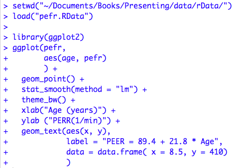
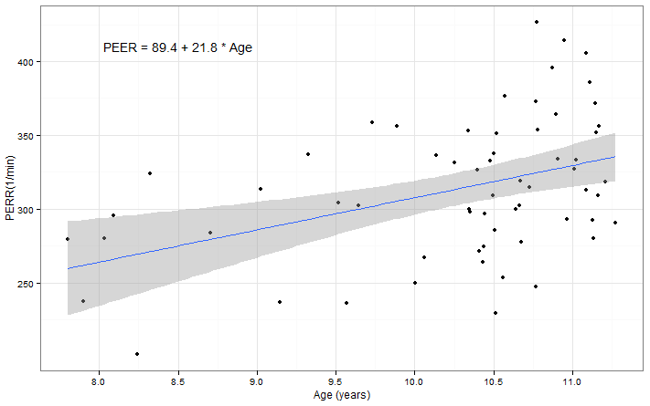
Box 9.14 and Figure 9.9 Code
Click here to show code with commentssetwd("~/Documents/Books/Presenting/data/rData/") load("pefr.RData") # Load the ggplot package to get access to the ggplot() function and many # supporting functions including aes(), geom_point(), stat_smooth(), theme_bw(), # xlab(), ylab() and geom_text(). # To learn more about ggplot2 look here: # http://ggplot2.org/ # http://www.statmethods.net/advgraphs/ggplot2.html library(ggplot2) ggplot(pefr, # Use the pefr datasets. aes(age, pefr) # Plot x = age, y = perf. ) + geom_point() + # Draw a scatterplot. stat_smooth(method = "lm") + # Add a regresssion line with CLs. theme_bw() + # Use a white background with grey details. xlab("Age (years)") + # Add a label for the x axis. ylab ("PERR(1/min)") + # Add a label for the y axis. geom_text(aes(x, y), # Add text at the position in the provided data # frame. label = "PEER = 89.4 + 21.8 * Age", # The data argument expects a data frame. The data.frame() function # coerces the tiny vectors named x and y to form a data frame. data = data.frame( x = 8.5, y = 410) )