Home > Output
Chapter 9: Analysing relationships between variables using SAS
Figure 9.1 Scatterplot for two variables
Figure 9.2 Output for Pearson’s correlation
Box 9.3 Presenting the results for Pearson’s correlation
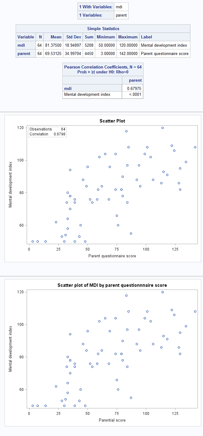
Figure 9.1, Figure 9.2 and Box 9.3 Code
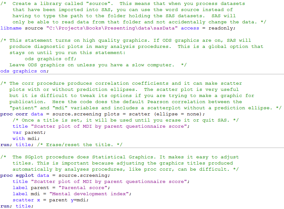 Click here to show code as text
/*  Create a library called "source".  This means that when you process datasets
    that have been imported into SAS, you can use the word source instead of
    having to type the path to the folder holding the SAS datasets.  SAS will
    only be able to read data from that folder and not accidentally change the data. */
libname source "C:\Projects\Books\Presenting\data\sasData" access = readonly;

/* This statement turns on high quality graphics. If ODS graphics are on, SAS will
   produce diagnostic plots in many analysis procedures.  This is a global option that
   stays on until you run this statement:
        ods graphics off;
   Leave ODS graphics on unless you have a slow computer.  */
ods graphics on;

/* The corr procedure produces correlation coefficients and it can make scatter
   plots with or without prediction ellipses.  The scatter plot is very useful
   but it is difficult to tweak its options if you are trying to make a graphic for
   publication.  Here the code does the default Pearson correlation between the
   "patient" and "mdi" variables and includes a scatterplot without a prediction ellipse. */
proc corr data = source.screening plots = scatter (ellipse = none);
    /* Once a title is set, it will be used until you erase it or quit SAS. */
    title "Scatter plot of MDI by parent questionnaire score";
    var parent;
    with mdi;
run; title; /* Erase/reset the title. */

/*  The SGplot procedure does Statistical Graphics. It makes it easy to adjust
    titles. This is important because adjusting the graphics titles produced
    automatically by analyses procedures, like proc corr, can be difficult. */
proc sgplot data = source.screening;
    title "Scatter plot of MDI by parent questionnaire score";
    label parent = "Parental score";
    label mdi = "Mental development index";
    scatter x = parent y=mdi;
run; title;
Figure 9.3 Scatterplots for several variables
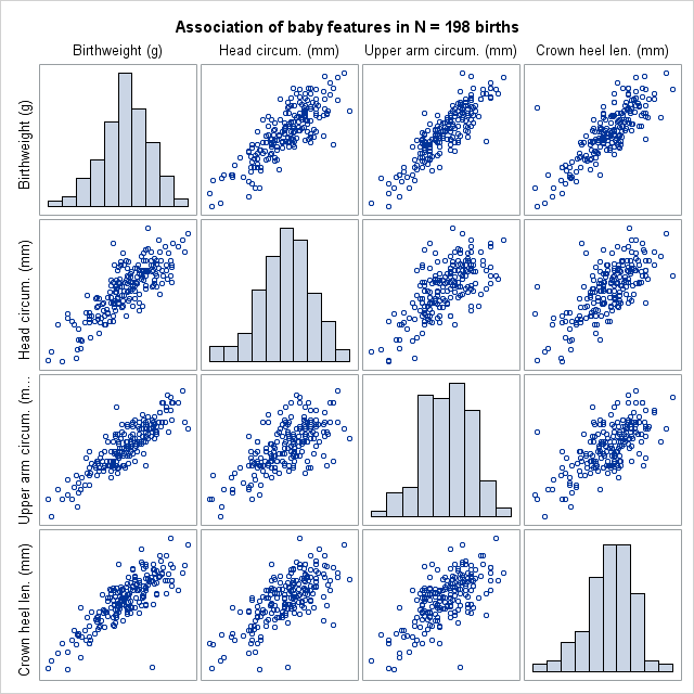
Code Figure 9.3
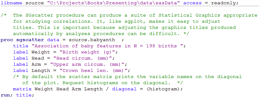 Click here to show code as text
libname source "C:\Projects\Books\Presenting\data\sasData" access = readonly;

/*  The SGscatter procedure can produce a suite of Statistical Graphics appropriate
    for studying correlations. It, like sgplot, makes it easy to adjust
    titles. This is important because adjusting the graphics titles produced
    automatically by analyses procedures can be difficult. */
proc sgscatter data = source.babyanth  ;
    title "Association of baby features in N = 198 births ";
    label Weight = "Birth weight (g)";
    label Head = "Head circum. (mm)";
    label Arm = "Upper arm circum. (mm)";
    label Length = "Crown heel len. (mm)";
    /* By default the scatter matrix prints the variable names on the diagonal
       of the plot. Request histograms on the diagonal.  */
    matrix Weight Head Arm Length / diagonal = (histogram);
run; title;
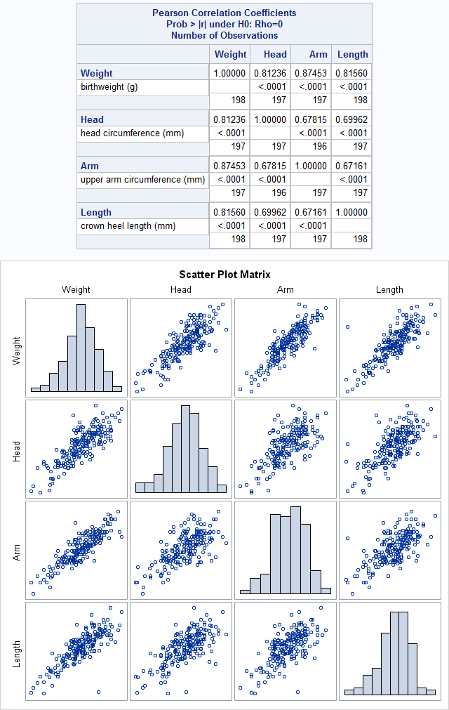
Figure 9.4 Calculating several correlations
Box 9.5 Presenting correlations between several variables
Code Figure 9.4 and Box 9.5
 Click here to show code as text
libname source "C:\Projects\Books\Presenting\data\sasData" access = readonly;

proc corr data = source.babyanth  plots = matrix (histogram);
    label Weight = "Birth weight (g)";
    label Head = "Head circum. (mm)";
    label Arm = "Upper arm circum. (mm)";
    label Length = "Crown heel len. (mm)";
    label birthwt = "Birth weight (g)";
    var Weight Head Arm Length;
run;
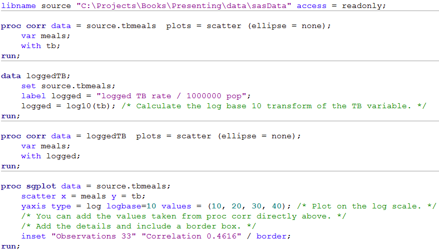
Figure 9.5 Presenting scatterplots (a) with skewed data and (b) where data are transformed
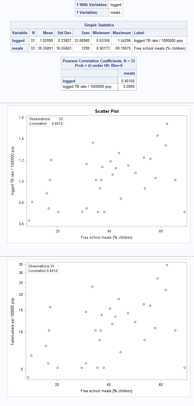
Figure 9.5 Code
 Click here to show code as text
libname source "C:\Projects\Books\Presenting\data\sasData" access = readonly;

proc corr data = source.tbmeals  plots = scatter (ellipse = none);
    var meals;
    with tb;
run;

data loggedTB;
    set source.tbmeals;
    label logged = "logged TB rate / 1000000 pop";
    logged = log10(tb); /* Calculate the log base 10 transform of the TB variable. */
run;

proc corr data = loggedTB  plots = scatter (ellipse = none);
    var meals;
    with logged;
run;

proc sgplot data = source.tbmeals;
    scatter x = meals y = tb;
    yaxis type = log logbase=10 values = (10, 20, 30, 40); /* Plot on the log scale. */
    /* You can add the values taken from proc corr directly above. */
    /* Add the details and include a border box. */
    inset "Observations 33" "Correlation 0.4616" / border;
run;
Figure 9.6 Output for a rank test
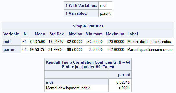
Figure 9.6 Code
 Click here to show code as text
libname source "C:\Projects\Books\Presenting\data\sasData" access = readonly;

/* proc corr can produce many correlation coefficients, including Kendall Tau. */
proc corr data = source.screening kendall;
    var parent;
    with mdi;
run;
Figure 9.7 Scatterplot of two variables with linear regression line
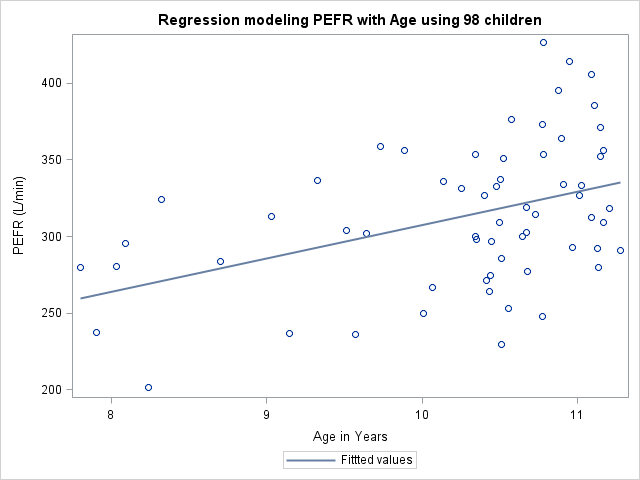
Figure 9.7 Code
 Click here to show code as text
libname source "C:\Projects\Books\Presenting\data\sasData" access = readonly;

title "Regression modeling PEFR with Age using 98 children";
proc sgplot data = source.pefr;
    /* Request a regression line fit through a scatter plot. Print "Fitted values"
       instead of "Regression" in the key. */
    reg x = age y = pefr/ legendlabel = "Fitted values";
    xaxis label = "Age in Years";
run; title;
Figure 9.8 Output for simple regression

Figure 9.8 Code
 Click here to show code as text
libname source "C:\Projects\Books\Presenting\data\sasData" access = readonly;

/* The reg procedure is useful for simple linear regression models.  If ODS
   graphics are on, it produces excellent diagnostic graphics. */
proc reg data= source.pefr;
    /* Predict PEFR with age and include confidence limits on the parameter
       estimates (betas). */
    model pefr = age / clb;
run;
quit; /* The reg procedure keeps running until quit. */
Box 9.11 Presenting the results for several predictor variables

Box 9.11 Code
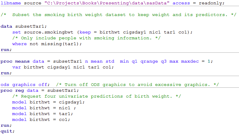 Click here to show code as text
libname source "C:\Projects\Books\Presenting\data\sasData" access = readonly;

/*  Subset the smoking birth weight dataset to keep weight and its predictors. */

data subsetTar1;
    set source.smokingbwt (keep = birthwt cigsday1 nic1 tar1 co1);
    /* Only include people with smoking information. */
    where not missing(tar1);
run;

proc means data = subsetTar1 n mean std  min q1 qrange q3 max maxdec = 1;
    var birthwt cigsday1 nic1 tar1 co1;
run;

ods graphics off;  /* Turn off ODS graphics to avoid excessive graphics. */
proc reg data = subsetTar1;
    /* Request four univariate predictions of birth weight. */
    model birthwt = cigsday1;
    model birthwt = nic1 ;
    model birthwt = tar1;
    model birthwt = co1;
run;
quit;
Box 9.13 Presenting the results of a regression model that uses a log transformation of the outcome variable

Box 9.13 Code
 SAS can not easily produce this output
Box 9.14 Presentation of a regression line used for prediction
Figure 9.9 Scatterplot of two variables with linear regression line and 95% confidence intervals
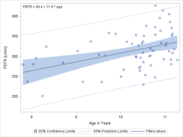
Box 9.14 and Figure 9.9 Code
 Click here to show code as text
libname source "C:\Projects\Books\Presenting\data\sasData" access = readonly;

proc sgplot data = source.pefr;
    /* Predict pefr with age. Include confidence limits on the mean and for individuals. */
    reg x = age y = pefr/ legendlabel = "Fitted values" cli clm;
    xaxis label = "Age in Years";
    inset "PEFR = 89.4 + 21.8 * age" ;  /* Add in the regression model defined above. */
run;

 Click here to show code as text

 Click here to show code as text

 Click here to show code as text

 Click here to show code as text

 Click here to show code as text

 Click here to show code as text

 Click here to show code as text

 Click here to show code as text

 SAS can not easily produce this output

 Click here to show code as text